Ron Jones House (part two) by Sasha Ward

Since exhibiting my window and wallpaper designs together earlier in the year, I have wanted to work on a project where I could decorate all the surfaces of a room. The IT room/lounge at Ron Jones House in Bristol turned out to be that project.

Linoleum Striato - Water Colour                                                               …

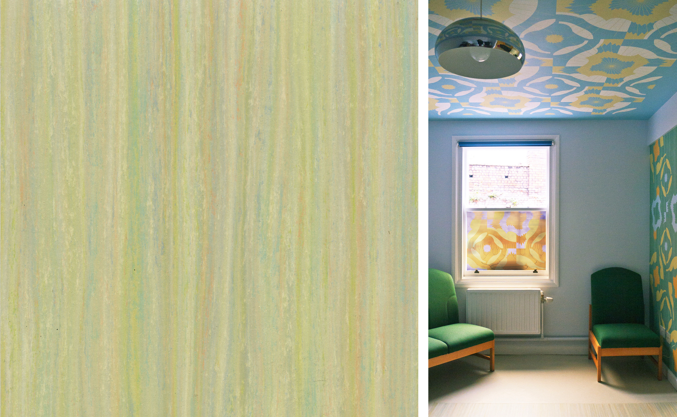
Linoleum Striato - Water Colour                                                                                    Left hand side of the room

This slightly daring linoleum, "Water Colour" , found its perfect home as the centre piece for the new room. The colour is light but also rich, invigorating and in tune with our colour range. I used its streaks as the background for my wallpaper designs, and didn't mind that once it arrived in the middle of my room layout (below) the original floor design - suitably altered - was banished to the left hand half of the ceiling.

Net for my final model of the room

Net for my final model of the room

Before and After, left hand side

Before and After, left hand side

The IT room/lounge was two rooms that have become one, so part of my task was to link the two halves while giving each its own feel. The left hand side is the IT side, and although the new wall colour is neutral the glow from the ceiling blues the colour in that half. In the right hand side, the wallpaper wraps around the seating area with the richest gold colour continuing along the wall behind the new sofa and across to the open door. 

Before and After, right hand side

Before and After, right hand side

The development of the design from my original repeating three colour motif to the version used on the windows and walls here was mostly achieved by stripping parts of the pattern away and allowing other parts to float around. I also wanted to make my original inspiration (from the plant in the sunlight) more visible, so I added fine lines as radiating suns, stars on the ceiling and vertical plants on the walls and window vinyls.

Details from the right hand side - window and wall designs.

Details from the right hand side - window and wall designs.

Ron Jones House (part one) by Sasha Ward

I have just completed my project for Ron Jones House, a property run by Elim Housing to provide supported accommodation for adults in Stokes Croft, Bristol. Working with staff and residents we have transformed the communal lounge/IT room with colour and pattern on the floor, walls, windows and ceiling. Part Two will describe the general scheme, this post is about the pattern I designed for use across all the different materials in the room.

I wanted to design a repeating motif simplified from aspects of the place that I particularly liked - sunlight catching a plant in one of the nice old windows and a circles with stripes pattern on the gates (both shown above).

How the pattern developed - linking windows circles, sunlight & leaves in different formations.

How the pattern developed - linking windows circles, sunlight & leaves in different formations.

Detail of the final design showing one repeat                     Floor design, to be laid in the centre of the room with a wide border

Detail of the final design showing one repeat                     Floor design, to be laid in the centre of the room with a wide border

The existing carpet was particularly grotty, so the plan was to replace it with a patterned floor cut from 3 colours of linoleum laid in the centre of the room with the design growing in density towards the two windows. However, budgetary constraints intervened and in the end the new floor was laid with a simple but lovely linoleum and my pattern moved to the ceiling, walls and windows. You can see the layout of the room and the options we considered in the photo of just some of the models I made of the space below.

It was only when I printed the pattern out full size and placed it on the floor that I remembered what my initial inspiration must have been and dug out my photos from last year's trip to Ostia, the harbour city of Ancient Rome, and to Hadrian's Villa nearby. At both sites current excavations are revealing more buildings, many with black and white mosaic floors based on circles.  Some of the most lovely patterns are the simple ones revealed in patches through concrete or grass.

Roman mosaics from Hadrian's Villa, Tivoli and Ostia Antica

Roman mosaics from Hadrian's Villa, Tivoli and Ostia Antica

The Four Marys by Sasha Ward

The Mary Window, St Martin-on-the-Hill, Scarborough 1868

The Mary Window, St Martin-on-the-Hill, Scarborough 1868

I have seen three Morris & Co. windows recently that use the same Burne-Jones cartoon for the figure of the Virgin Mary, in the centre above, and I've written about two other versions, below, in previous posts. This post is called "The Four Marys" in honour of the strip cartoon from "Bunty" magazine and for the other Marys alongside the Virgin Mary:  Mary of Bethany at Scarborough, Mary of Cleopas at Sopworth and Mary Magdalene in both churches. However, I find that I am not particularly interested in the iconography, or the stories that the guidebooks to the churches tell about the artists, possible models and local patrons involved. What I look at is the way that the figures have been inserted into the window shapes and how they contrast with the backgrounds used in each case: richly coloured and geometric at Scarborough, small figures in quite a basic scheme at Beaudesert, popping out of the lancets but with a more sophisticated organisation of the background at Sopworth.

The Mary Window, Sopworth, Wiltshire 1873                                                          &nbsp…

The Mary Window, Sopworth, Wiltshire 1873                                                                  Saints Mary and Michael, Beaudesert 1865

Below, in ascending order of preference, are three shuffled Virgin Marys. What a difference the colour contrasts and patterns used for furnishings and fabrics make to the very same figure whose clothes and lily can be made to join perfectly. The dark iron oxide paint on the later version has lasted much better than the paint recipe that the firm used in its early years.

Familiar Figures by Sasha Ward

West window, St. Helen's Church, Welton with Melton, Yorkshire. EBJ                   Malmesbury Abbey, 1901          Click to enlarge

Visiting churches with windows made by the firm of Morris, Marshall, Faulkner & Company, and after 1874 by Morris & Company, throws up familiar figures. In St Helen's Church, Welton (about ten miles west of Hull) there are five Morris & Co. windows with figures mostly designed by Edward Burne-Jones who had a local family connection. The large west window has beautiful roundels above and King Ethelbert on the right who I immediately recognised from a recent trip to Malmesbury Abbey , initially by his magnificent leggings.

The St. Nicholas at Welton (below centre) was familiar to me from his facial features: when you look at the earlier window at Beaudesert you see a different portrait of the same figure. I find the background details particularly interesting - ways of depicting underfoot plants, borders and backgrounds. I love the illusionistic dark blue curtains on poles behind the Welton figures - this photo of Mary comes with a real decaying tassel and cobweb in front of the window. 

The Virgin Mary and St. Nicholas from Welton Church, EBJ  : An earlier version of St. Nicholas from Beaudesert

Saints Ursula & Catherine from Welton Church, EBJ & WM                                                    …

Saints Ursula & Catherine from Welton Church, EBJ & WM                                                       The St. Catherine at Kelmscott Manor

In the same church I stood enthralled in front of St. Catherine, thinking how great the combination of book, sword and beautiful green dress was. Nothing interesting in the background to distract you here. The fun part of window spotting is remembering where you've seen someone before, and this St. Catherine is also on an embroidered brown velvet curtain at Kelmscott Manor, it is one of my favourite items there. I checked by putting the embroidered face on top of the stained glass one that the details are no different, only the size and the colour. Although I am reluctant to believe the guides, all the ones I have consulted attribute this figure to William Morris who supposedly couldn't do people.

Why Do Anything New? by Sasha Ward

1970

1970

This drawing is called "Myself Going to School on the First Morning" and it had a whole page in the school magazine that year. Looking at my old drawing, I find myself transported to the moment I was doing it - I remember the scratchy dip pen, the decision not to finish off the paving pattern and the dots that I used to plan the shapes of the clouds that were supposed to be hidden by the stripy sky. The most authentic details are my lovely new shoes, briefcase and donkey jacket and the most amazing thing is how all the elements that make my artwork particular to me are present in this example. 

The cover of the magazine in that year of my first morning brings back more wallpaper memories. B.H.O. (english teacher) wrote in his editorial; "The School has been redecorated, and we can now well imagine the former elegance of the eighteenth century houses that constitute the School. To commemorate this event, our cover this year is an adaptation of a piece of wallpaper from the entrance hall". This wallpaper is listed as Sanderson's "Rivoli" in the index. The overblown floral shapes on top of irregular stripes are just like something I am designing at the moment.

1974

1974

This drawing, printed on the sort of brown paper I like to use now, has a whole page in the 1974-5 magazine. I  think it's based on observation, in fact I'm pretty sure it's of Caroline Fitt, but I think of this as another self portrait. The detail that amazed me when I saw it again was the horizontal dot pattern. I've tried to limit my use of this as a filler pattern, thinking that I'd picked it up at a later date from looking at Paul Klee. I admire the time it must have taken me to keep the dots varied in shape but not scale, perfect for that scratchy pen. So, why do anything new ? I don't think I could improve on these self portraits now.  

More recent examples of the patterns I used in those early drawings: Left to right: The vertical waves at Langley Green Hospital 2008: The stripy sky at The State Hospital 2009: The dot pattern at Longparish School 2005. Click on photos to enlarge.