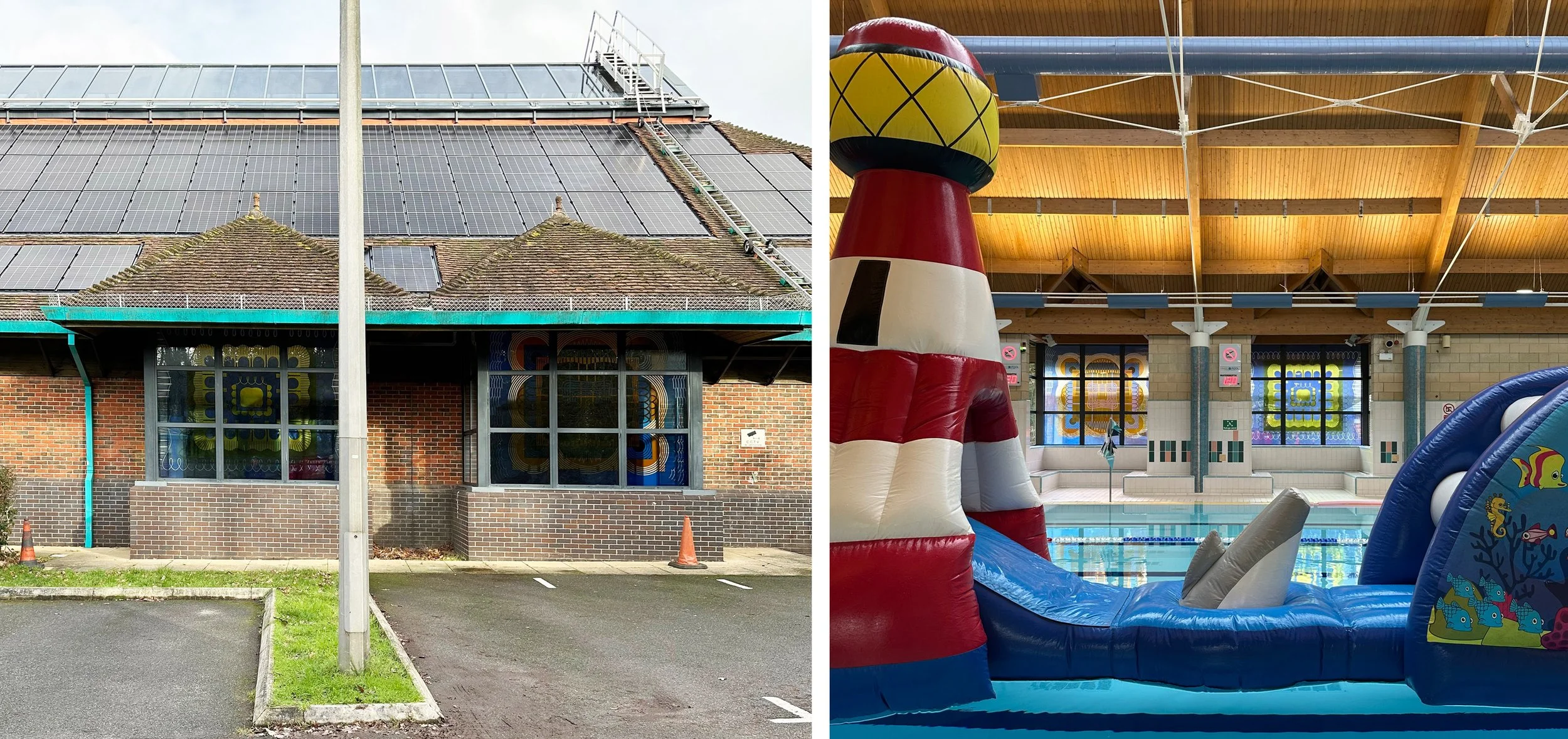
Tadley Health and Fitmess Centre, Hampshire: Pool windows from the outside and the inside.
I returned to Tadley Pool for the first time in 28 years to see if the windows I’d made were still there - the answer was yes and they were looking absolutely great. We were invited in to take photos before the inflatable fun session started (above right) and I thought, as I had at the time, what an odd place it was to have stained glass windows. Because of that and the fact that I’d never had any good photos of them, I’d had a bad opinion of these windows and was now taken aback by how much I liked the design and the colours. The late 1990s was a time when local authorities commissioned art for new public buildings, and it was evidently a good period for my work.
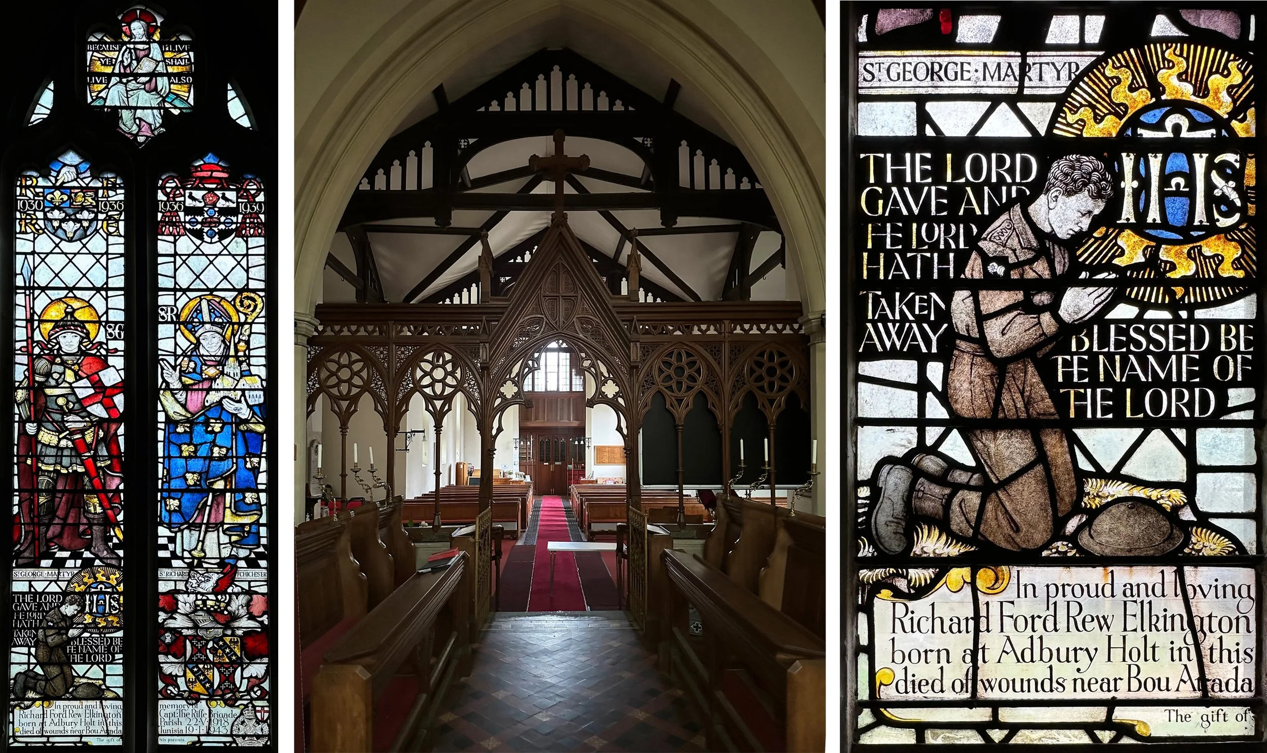
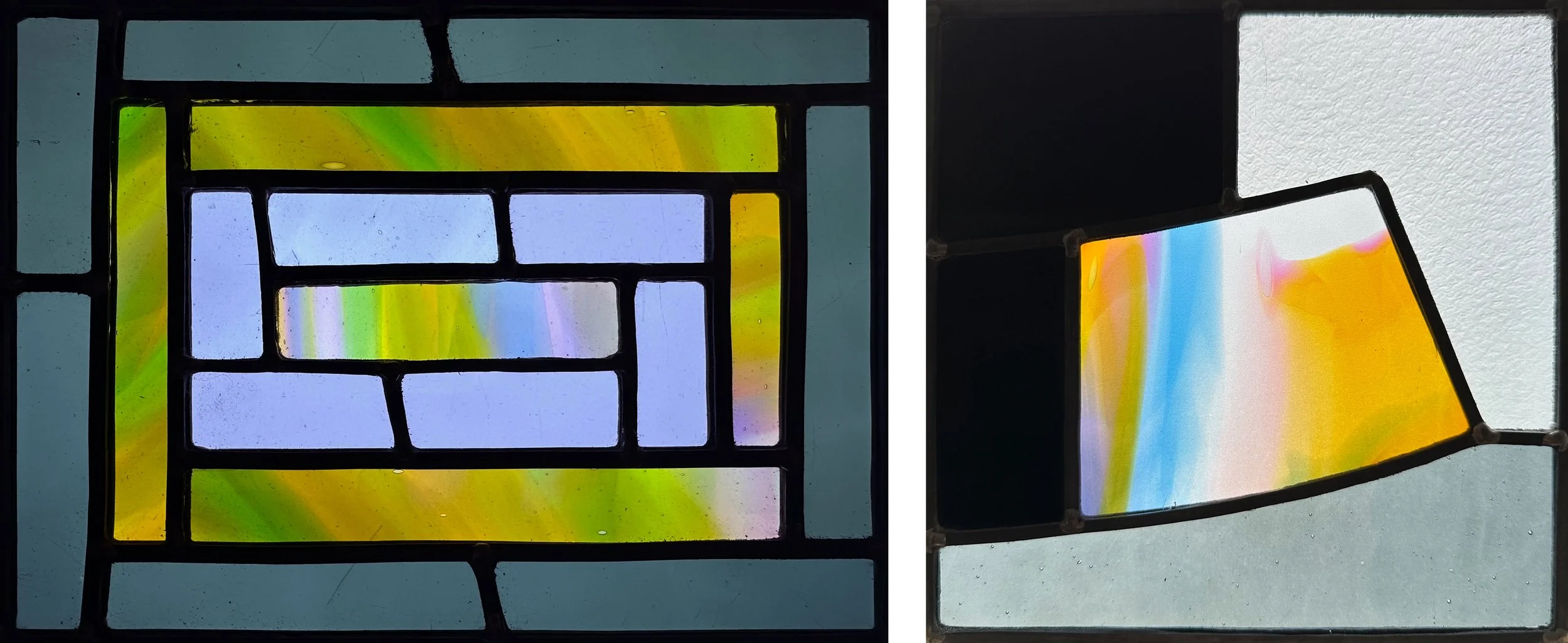
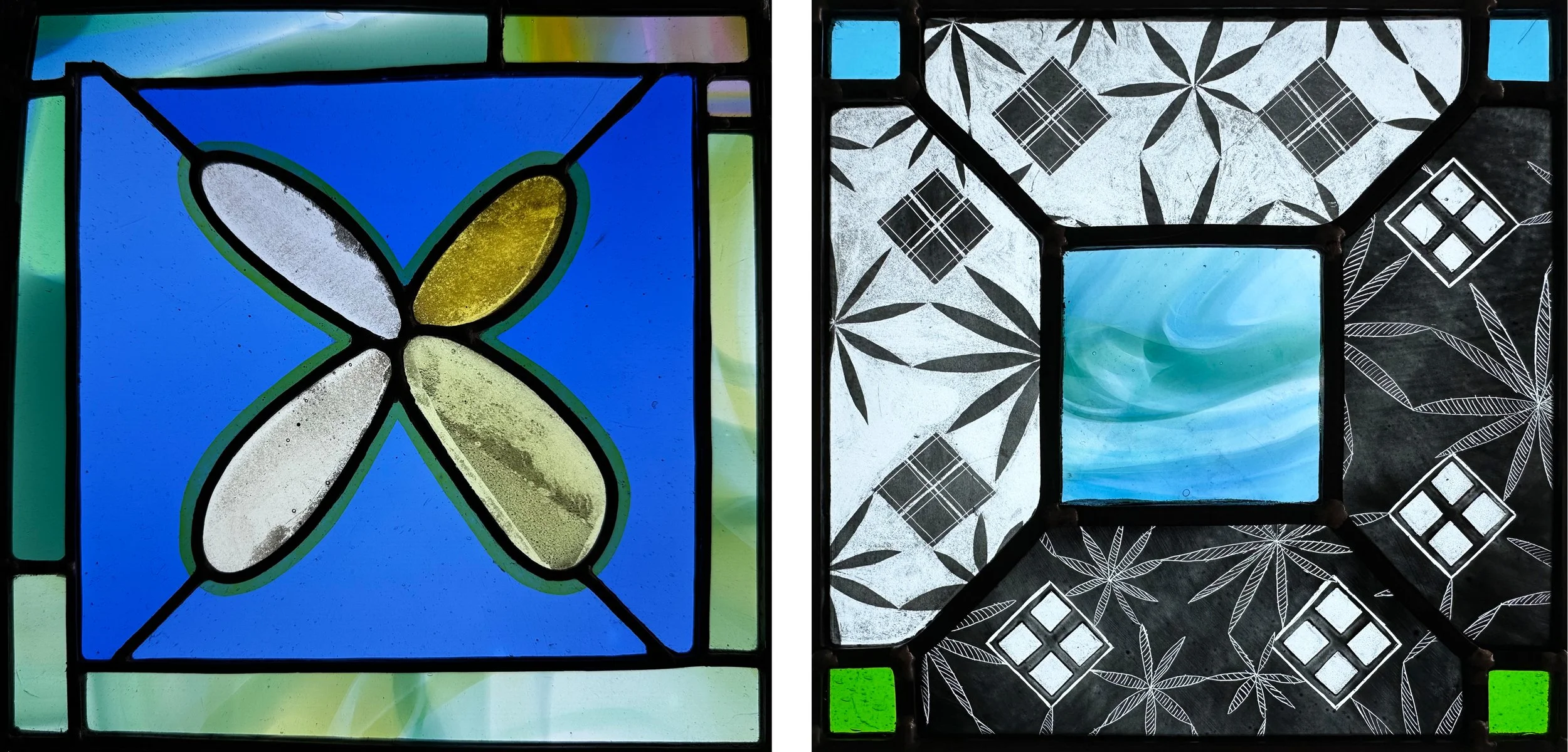
Two windows at Tadley pool 1998. Each 2.6 × 2.9 metres.
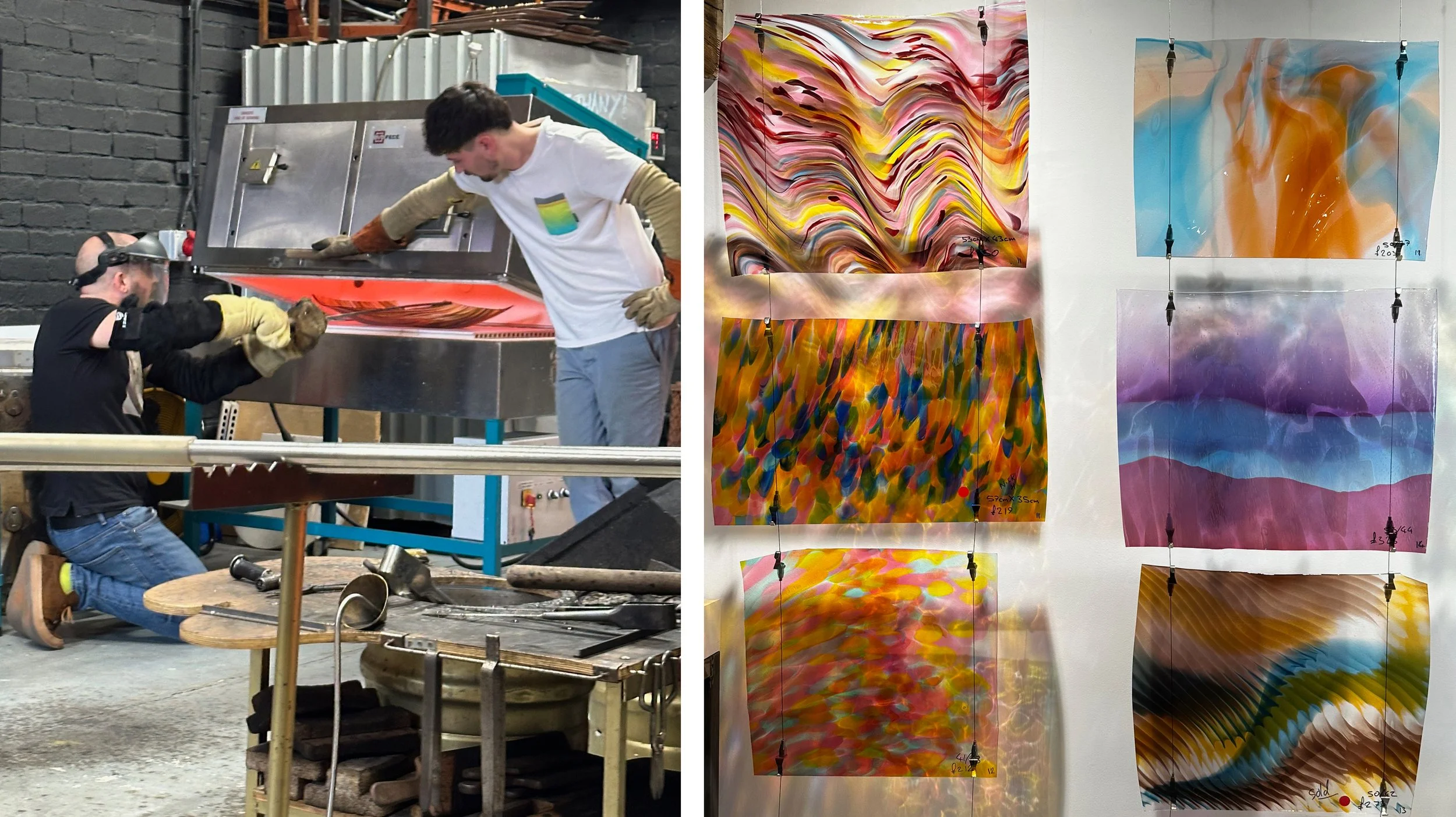
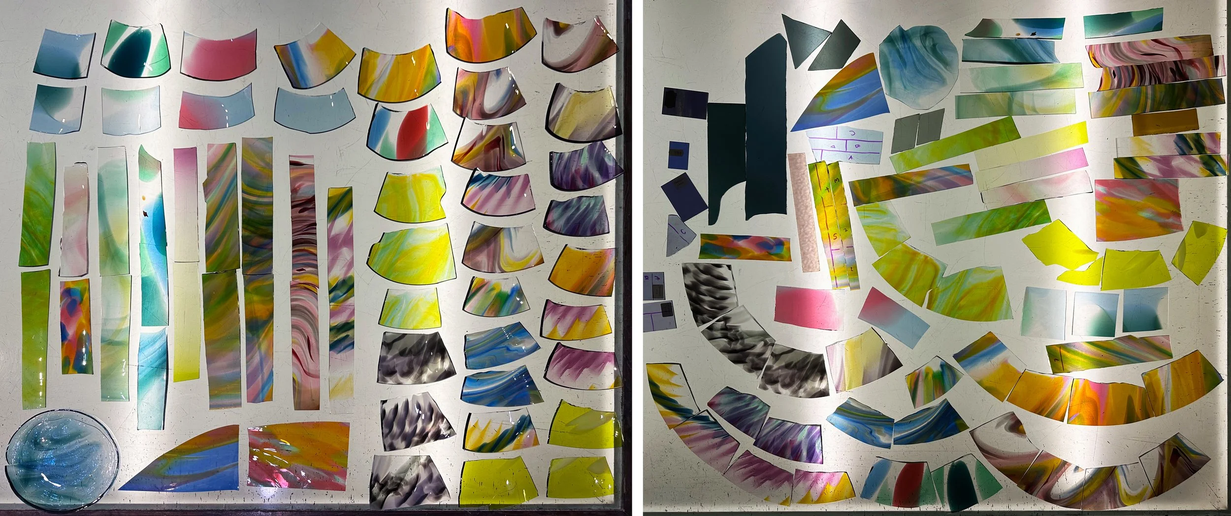
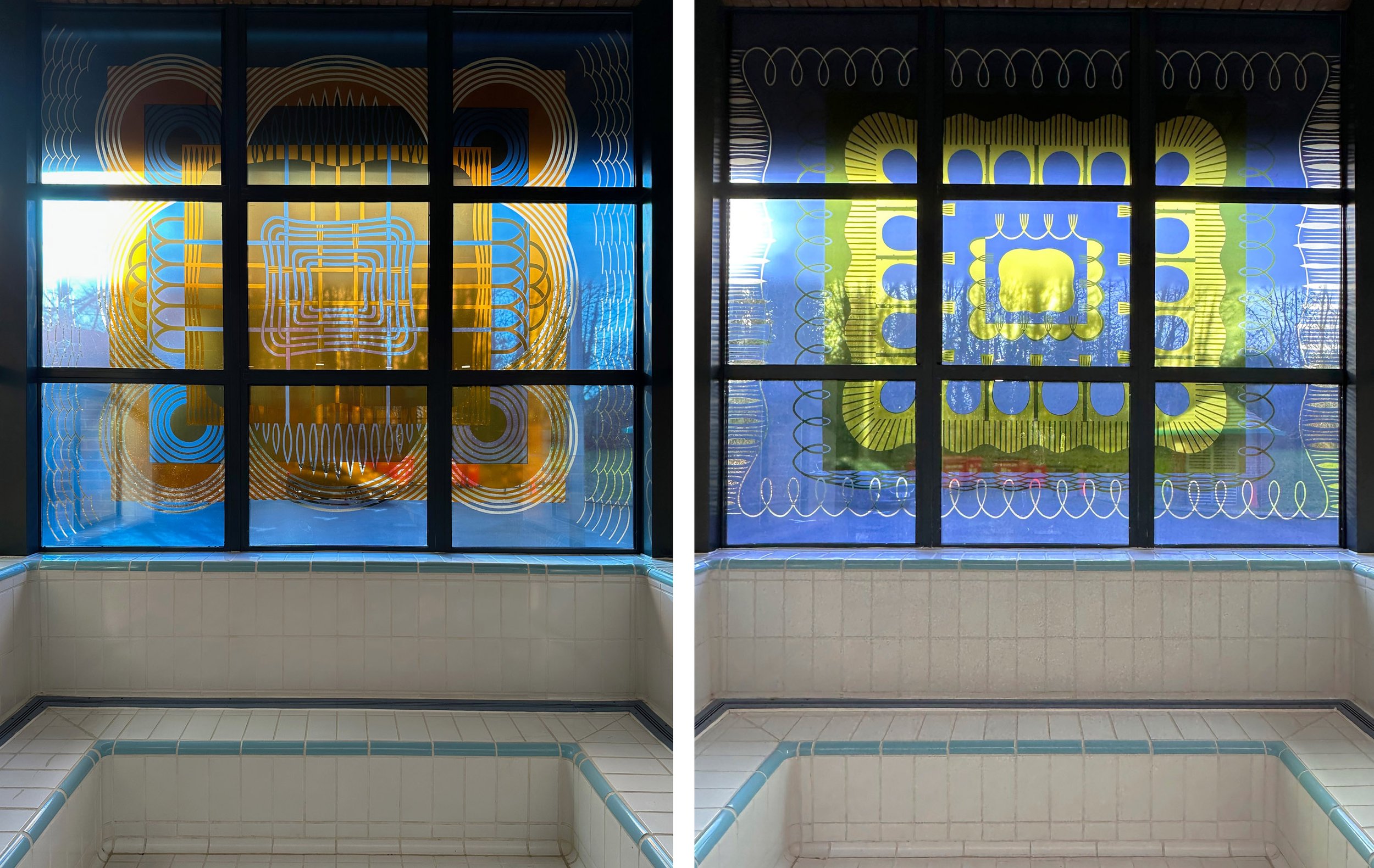
The windows were screen printed at Proto Studios which was located in Greenwich at the time, using old fashioned technology. I drew out the designs in black ink, these were photographed and made into screens resulting in a finish where I can recognise my own hand drawn lines. Each window has a different combination of a blue and a yellow with a third colour on the overlaps and a clear white line rather than a sandblasted white one. The screens for the edge panels were flipped for the panel opposite, making this commission one with a very effective use of a smallish budget.
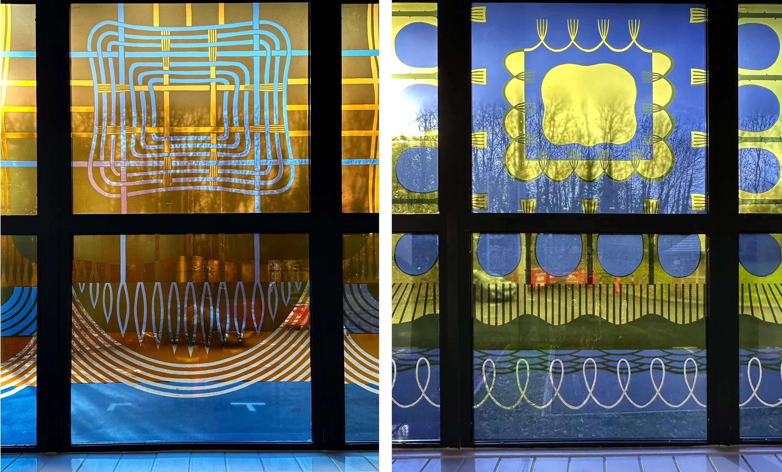
Details of the centre panels
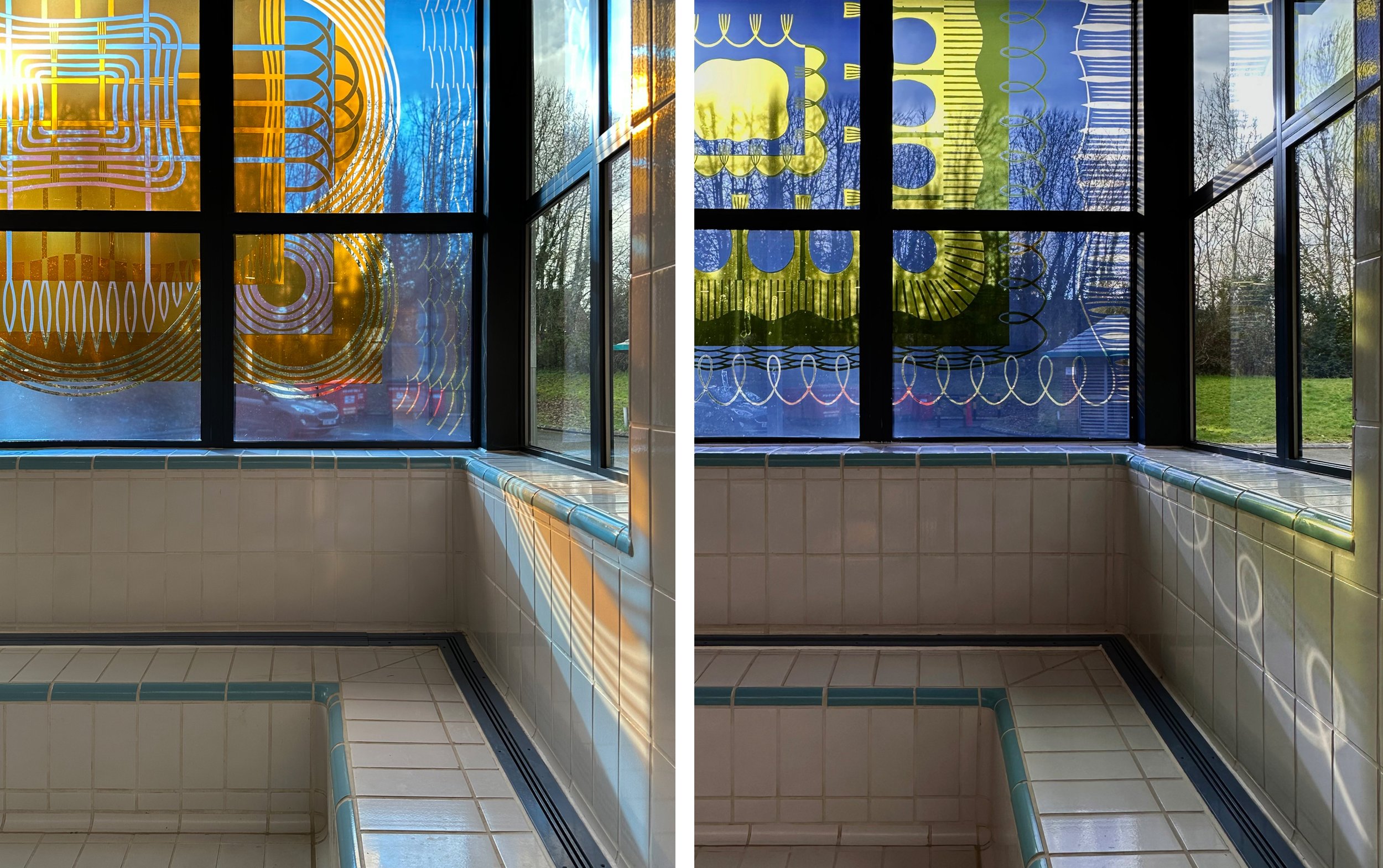
Sunshine through the corners, the clear lines stand out in the transmitted coloured light.
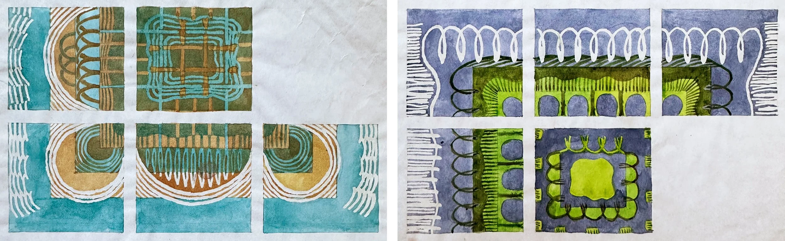
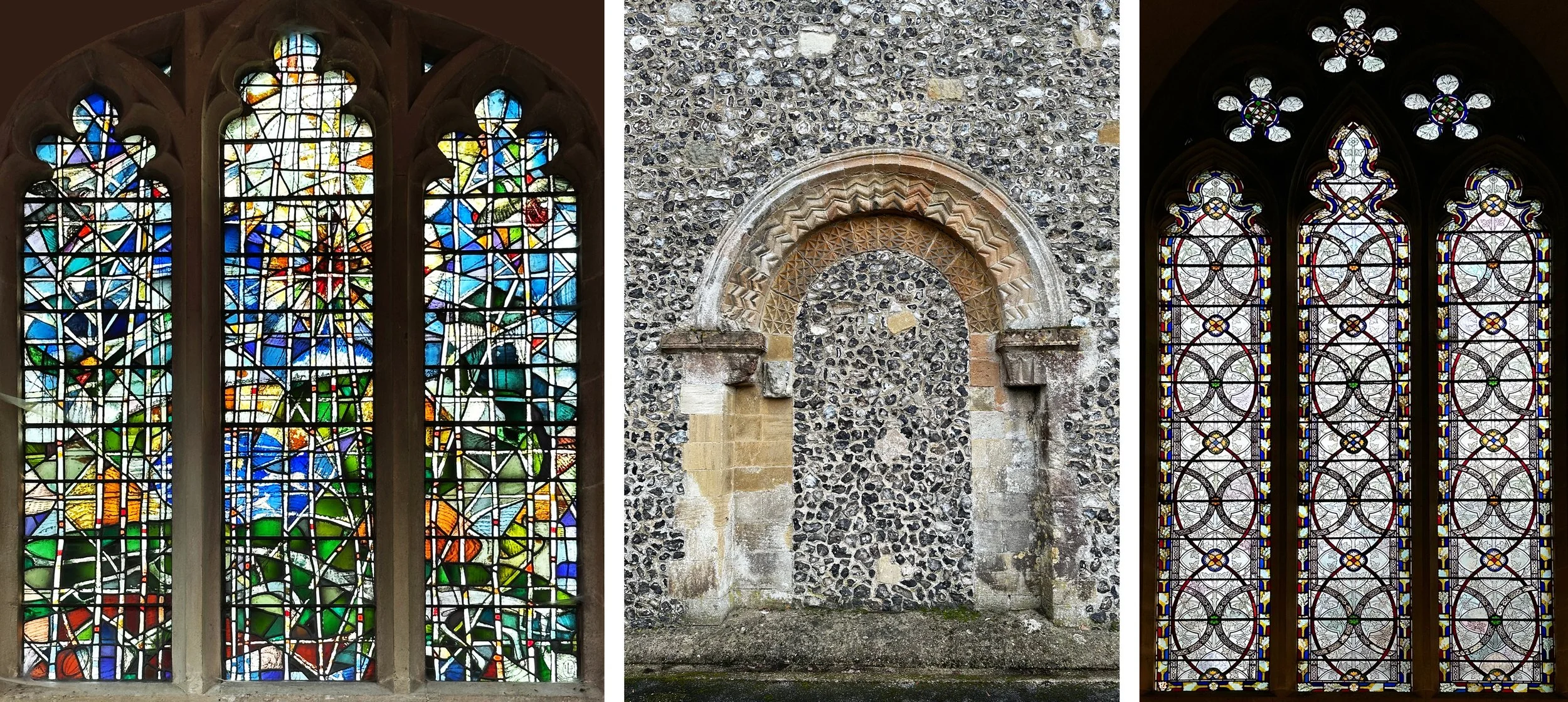
Small watercolour design for the windows.
Back in the studio I found the watercolour designs, tiny but close in feel to the final product. I’m now thinking of how much I can learn from looking back at the way I used to do things before computer technology intervened in the drawing up process and everyone’s work started looking slightly similar.
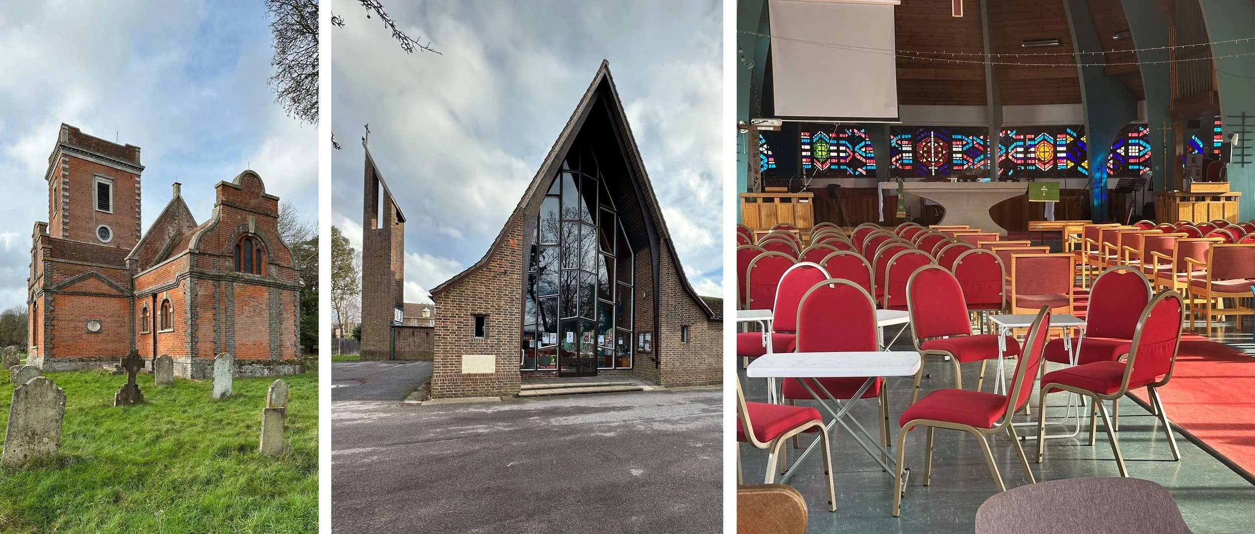
I also remembered the window I made as part of the same public art project in the nearest infants’ school, Bishopswood. The school colour was red and the theme was trees, as it was for the pool windows. The design was directly from eleven of the children’s drawings and I leaded the window up in the school so that the pupils could see how it was made, and handle (health and safety was also great in those days!) the glass pieces. This was a window that I always really liked, hopefully it’s still there too.
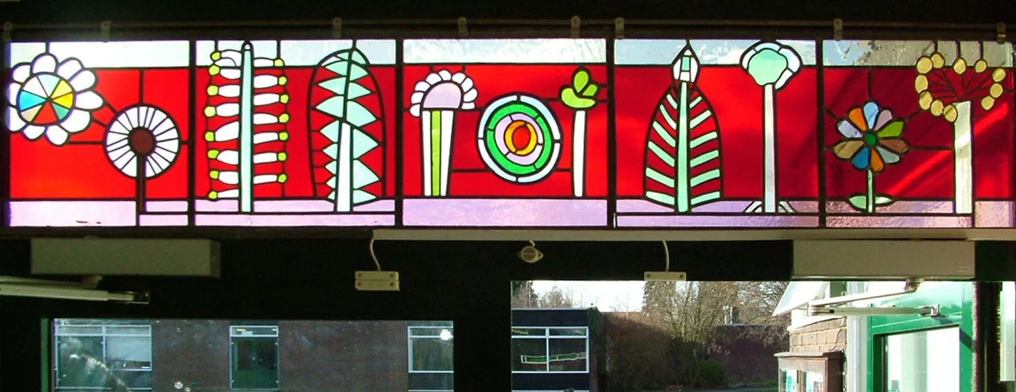
Bishopswood Infants School, Tadley. Window above the entrance doors.