interior design

Volcano Club Headquarters, Levenshulme by Sasha Ward

Installation day at Volcano Club HQ, glass always looks brighter reflected in the mirror.

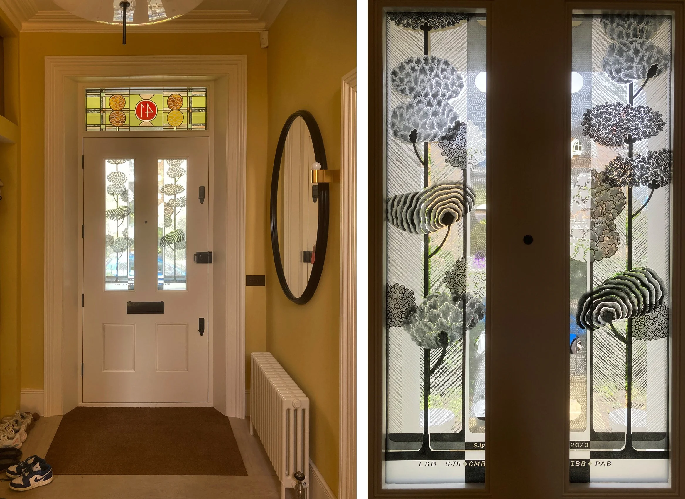
A new front door and surround made the installation of this fanlight an easy job, with pop in plastic beading and two extra pairs of hands to help. The hallway is narrow and we didn’t want to lose much light, so the fanlight is mostly done with transparent enamels and the colours on the vinyl door panels fade off towards the top where they line up with the clear bottom of the fanlight. Of course it doesn’t look clear in the photos as you can always see what’s through the glass and the colours change accordingly. Much of the day was spent waiting for the black and blue cars parked right outside the house to move so I could get a good photo.

Afternoon light and black car through the fanlight and door panels

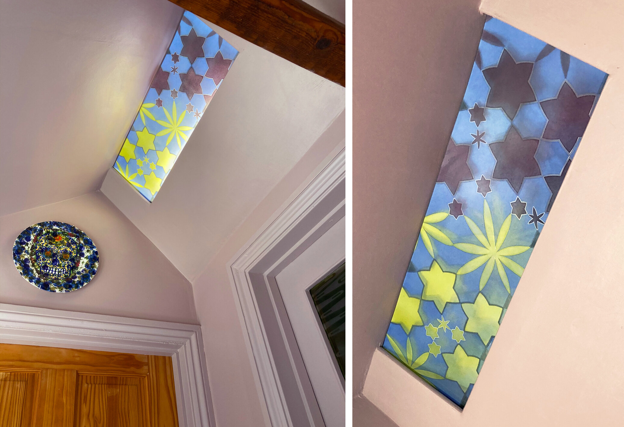
The design links the windows together with two straight pine trees that peep into the bottom of the fanlight like eyes with sandblasted, therefore very white, brows above them. The colours are the house colours of pink, orange and green with blue for the lake above and to give the illusion of a blue sky when really you are looking at the white inside of the porch.

Details of the vinyl door panels

The textures are just as important as the colours. The rippled side of the glass is on the outside of the door panels, leaving a flat surface to stick the vinyls on to and no need to make any of the colours opaque. The textures on my fanlight glass were so good that I decided to put the decorated side of the glass on surface 4 of the double glazed unit - that is facing in to the interior rather than protected inside the unit (on surface 2) which is the usual practice.

Details from the fanlight: textures made with sandblasting, brushes, rollers and the qualities of the different enamels I used.

In case you’re in doubt, it’s Mount Fuji. There is a selection of Fuji merchadise in the Volcano Club collection, including the crumpled t-shirt, face mask, sweet packet and enamel brooch shown below, next to the hair clip which makes the best use of the distinctive triangle with the white top, which on my glass is clear.

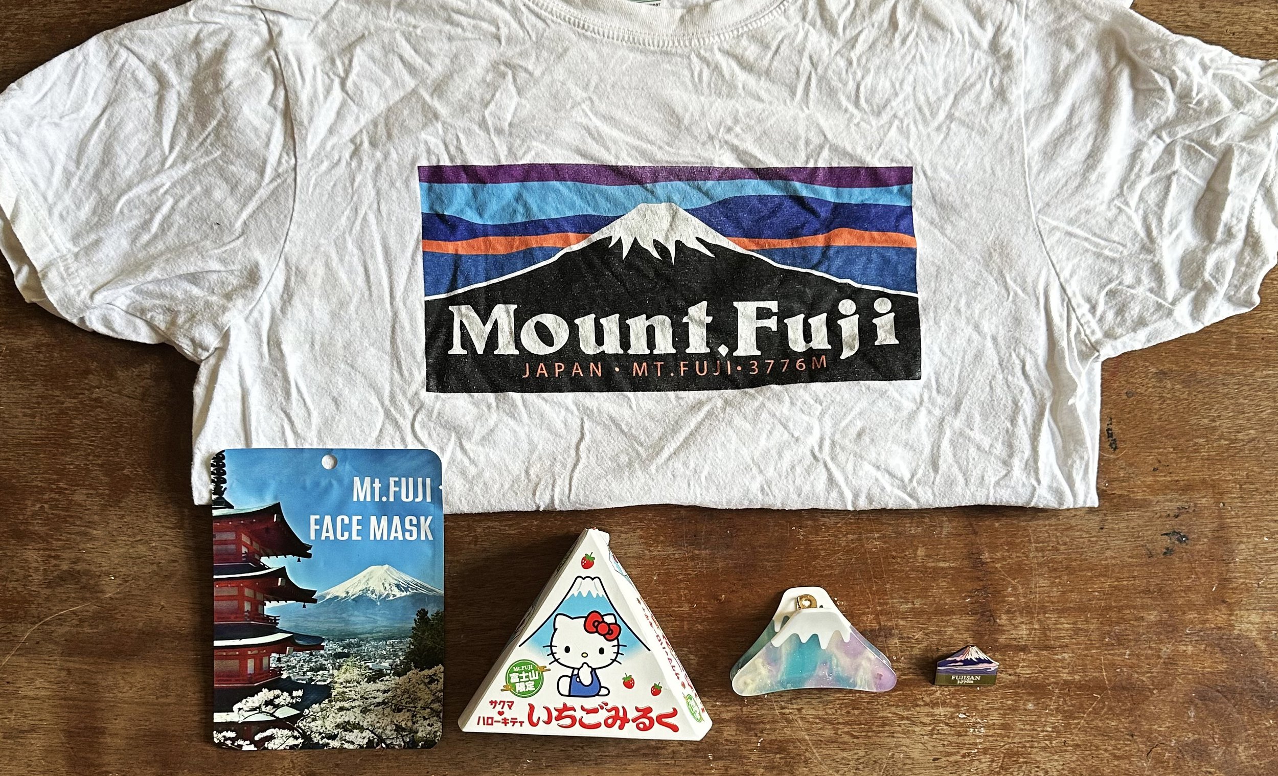
Mount Fuji merchandise

NUMBER 41 by Sasha Ward

I returned to see a set of windows I designed and made last year for a house in Stockwell, London, no 41. I wrote about all of these windows while I was making them in previous blogs, so this post is about how they work in the space. It’s an early Victorian four storey double fronted house that the architect owner has completely refurbished - I’ll have to go back again to take a shot of the front elevation when the light is right (I mean when I remember to turn it on behind the fanlight).

Front door and fanlight above: double glazed front door panels. The initials (& the shoes) belong to family members.

At the front there is a stained glass fanlight using colours that run through the house - ochre, gold, silver, red, pink and pale green, all of them in warm shades. Lined up with the yellow foliage blobs on the fanlight are two rows of trees on a pair of double glazed panels in the door below. I used both inside surfaces of the glass in the double glazed units to paint and sandblast on, creating the depth you can see in the detail below. The glass provides the right amount of privacy up close and also lets a lot of light in.

Front door and reflection: detail through the two layers of glass.

The back of the house: back door from the inside.

The back door faces south to a large unshaded garden. The techniques I used, again sandblasting and enamelling on the two inside surfaces of the double glazed units, show up really well from the outside and also very dramatically in sunshine. These are midsummer photos, in winter the colour travels further along the adjacent walls and the two different oranges in the glass are intensified on the yellow ochre background. I left a lot of clear glass for visibility in to the garden, you see this window down a short flight of stairs as soon as you come in the front door of the house.

Details of double glazed panels in the back door.

Second floor bathroom from the outside (lights on): from the inside.

The bathroom glass was the first I made for the house, the design was an enlargement of the colour samples I make with every colour agonised over until we got the right mix (and then they do unexpected things in the kiln). In the master bedroom it’s mainly yellow (above), upstairs serving the children’s bedrooms (below), there are more colours and a bigger difference when the lights are on and off. These colours are hand painted on etched glass so there is no chance of seeing through the glass in these lovely, functional sliding doors.

Top floor bathroom from the outside (lights off): from the inside.

Bathroom Doors by Sasha Ward

Colour samples, screen printed and hand painted enamels.

When I meet a new client, I usually have the three glass samples shown above in my bag. I have made hundreds of these over the years as I experiment with the colour and texture of overlapping stripes of vitreous enamel and iron oxide on clear glass, but these three are somehow the best and most admired. On the latest occasion my client liked the samples so much that she wanted a design for the glass panels in two bathroom doors based on the idea of the colour sample.

Colour samples in my studio windows.

Once I’d worked out the best proportions for the horizontal and vertical bands on the tall thin door panels, I set to work on new sets of colour samples using an etched, therefore transluscent rather than transparent, glass. One set was based on a golden colour range, the other set needed to coordinate with the bathroom’s terracotta tiled walls and floor. It’s hard mixing transparent glass enamels to match a colour, particularly in the warm orange range where things easily go towards brown - as you can see in the nine samples for this project in my studio window (above right). As much as the amounts of each powdered enamel you put in the mix, the result is affected by how you apply the enamel, in this case I hand painted (as opposed to printing or spraying) to achieve the textures in the original favourite samples.

On the table (below left) you can see the glass on my lightbox with the vertical stripes fired on and the samples I’m trying to match above them. The finished panels (below right) show the second layer of horizontal bands in a contrasting but paler colour range of greys, greens and some blue.

Left, half done panels on the table. Right, two finished panels in the studio.

First floor bathroom door installed.

The panels are finished and installed before the rest of the rooms are ready - so fingers crossed for their safety while work goes on around them. Both sets of colours are good, not exactly the same as the samples of course, with some unexpected mixes and welcome blemishes. The best aspect of the painting is that I have kept the layers light and thin which is a good glass painting tip - it’s easier to add than to remove.

Second floor bathroom door installed.

Bathroom Windows by Sasha Ward

This winter we’ve painted our hall spaces pinky grey, a colour that we chose to compliment the greens and oranges we had in our interiors. The hall is lit by a concealed strip light and although it looked fine as it was I thought I could add something more to the space by making a glass panel to cover it. You can see it installed with the light on and off below.

Left: All three windows with the lights on.  Right: Ceiling and door window with the lights off.

Left: All three windows with the lights on. Right: Ceiling and door window with the lights off.

The new panel had to go with the windows I’d made in 2005 for the house, two of which you can see at the same time as the new one (above left). For our own windows I’ve used intricate, geometric patterns - I see these windows as an opportunity to use favourite designs that didn’t quite fit in to the schemes I was working on at the time. The bathroom window has a pink/green/gold repeating circle which looks great from a distance (below left) and the door panels have pale blue flower/stars floating across olive green horizontal bands on an etched background. You can see how good these colours look with the lovely brown quarry tiles and red brick of the bathroom walls below.

Inside the bathroom - Left: window.  Right: door.

Inside the bathroom - Left: window. Right: door.

So for the new design I plotted out a flower/star design on a hexagonal grid, thinking of the central flower as a burst of light from the centre. Each point meets another point, but the geometry is not organised into a regular pattern. I wanted the colour to change in the middle as this panel is at a meeting point with a door to the left and the right, and I also wanted it to go with the plate that greets visitors to the spare room on the left which we bought from Rob Turner (below left). As usual the colours, which are transparent fired enamels made of a mix of different pigments, aren’t exactly as I’d planned, the yellow is not quite olive enough and the pink is too dark. However the window sits very well in its place, it’s nice to look up and see a few unexpectedly twinkly stars inside the house.

Outside the bathroom - Left: light on. Right: light off.

Outside the bathroom - Left: light on. Right: light off.

New ceiling panel, 210 x 620 mm.

New ceiling panel, 210 x 620 mm.

Paradise Lost by Sasha Ward

This is the drawing (below) used for our first collaborative stained glass panel commissioned as a window, chosen by the clients because of its proportions and its suitability for a bathroom window. It’s a small black and white ink drawing called “There is a Grain of Sand in Lambeth that Satan cannot find” and is based on a famous story told by William and Catherine Blake's friend Thomas Butts. At the end of the Blakes’ garden in Lambeth was a small summer house, and coming to call on them one day Butts was shocked to find the couple stark naked: "Come in!" cried Blake; "it's only Adam and Eve you know!" The Blakes were reciting passages from Paradise Lost, apparently "in character." As is usual in the work of Ray Ward, the inspiration is hidden - it was an added bonus to find out who the characters were when the commission was underway and we were able to decipher the title, which is a quote from Blake’s poem “Jerusalem”.

Ray’s drawing, “There is a Grain of Sand in Lambeth that Satan cannot find” (170 x 275mm) and stained glass interpretation of the same (320 x 600 mm).

Ray’s drawing, “There is a Grain of Sand in Lambeth that Satan cannot find” (170 x 275mm) and stained glass interpretation of the same (320 x 600 mm).

The glass was installed in the top half of a ground floor loo window. It provides privacy from next door’s windows without blocking the view of plants on the windowsill. There are two bonus reflections - in the mirror on the left and in the opaque glass door panel to the right in the photo below, and in front of you when you’re seated on the loo.

The panel installed in the bathroom window.

The panel installed in the bathroom window.

Stages of making

Stages of making

This window uses every type of glass and technique in a sequence of steps that I photographed throughout the process (above) as follows.

Stage 1, the straightforward bit, choosing and cutting the glass. Stage 2, shows the glass pieces laid on top of Ray’s drawing which has been scaled and shifted to fit the window proportions. Stage 3, the first layer of iron oxide painting into lines I’d sandblasted to provide definition. Stage 4, 2nd layer of painting in some areas, pink glass masked out for sandblasting, table and steam lines already blasted out. Stage 5, pink flashed glass sandblasted, took ages! Stage 6, the most fun part was the final painting - silver stain on the chairs, enamel on the mugs, iron oxide on the book and the faces. I traced these directly from Ray’s drawing. As you can see in the detail below, I think I got their expressions quite well. The only elements I changed were on the book, I didn’t mind the crazy perspective but thought I could do with some better lettering, and the shape of the mugs became the type they use in the house which are made by one of its occupants.

Detail comparing drawing with glass

Detail comparing drawing with glass

In my line of commissioned work I’m used to getting the colours and the composition right for a particular place, but the figurative element in these joint pieces is something I haven’t touched since I was a student. For me, they are all about the people. Ray always denies that there is anything autobiographical going on in his drawings, but we had our portraits taken underneath the window on installation day, just to check.

Window from the outside and the inside.

Window from the outside and the inside.