sketchbooks

Clouds and Planes by Sasha Ward

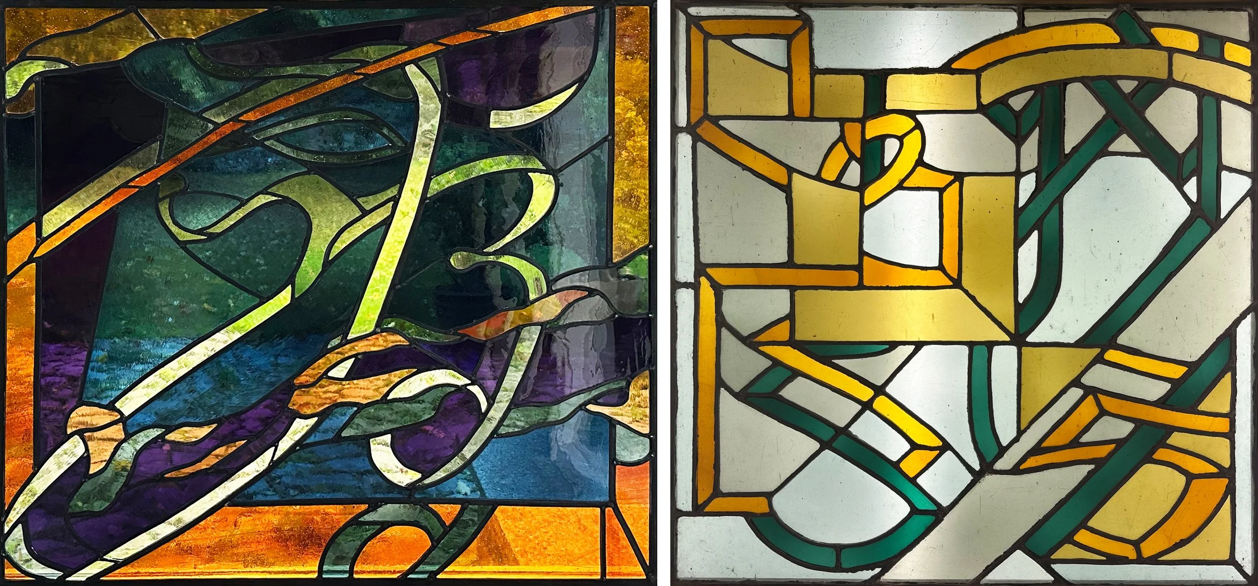
Left: My first commission 1979, 790 × 860 mm. Right: from 1978, 650 mm sq.

Following on from the last post about my first commission (shown above left) I have been searching through my old work. I made the three pieces above & below at The Central School of Art to the dimensions of windows in my parents’ house in Wimbledon in front of which these all used to hang. Initially I thought I could reuse the glass for the restoration of my first ever commission, but there were no exact colour matches. Then I started to quite like the pieces and decided to save them as they are, unpainted and with great colour combinations in beautiful glass made by Hartley Woods.

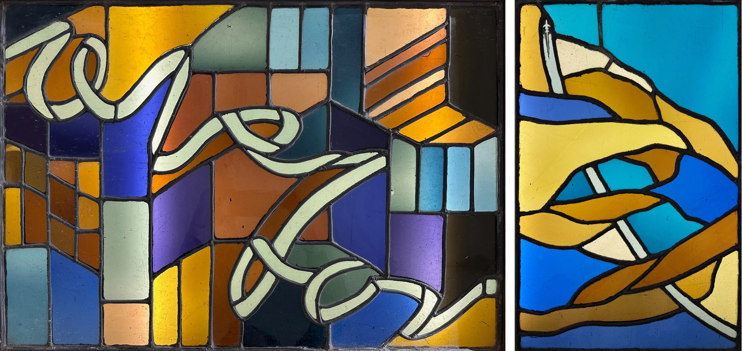
Left: from 1978, 520 × 750 mm. Right: from 1979, 520 × 350 mm.

Looking also at my sketchbooks from the time, I found a thread which started with drawings of the sky, with aeroplanes and clouds. My first attempt at this subject matter (above right) fits into the worst category of cloud - solid and static with a badly painted aeroplane. I remembered another panel and although I could only find the drawings that related to it (below left), this one was definitely better, with pink and yellow glass and drippy bits of painting on the clouds which are starting to move in a diagonal direction.

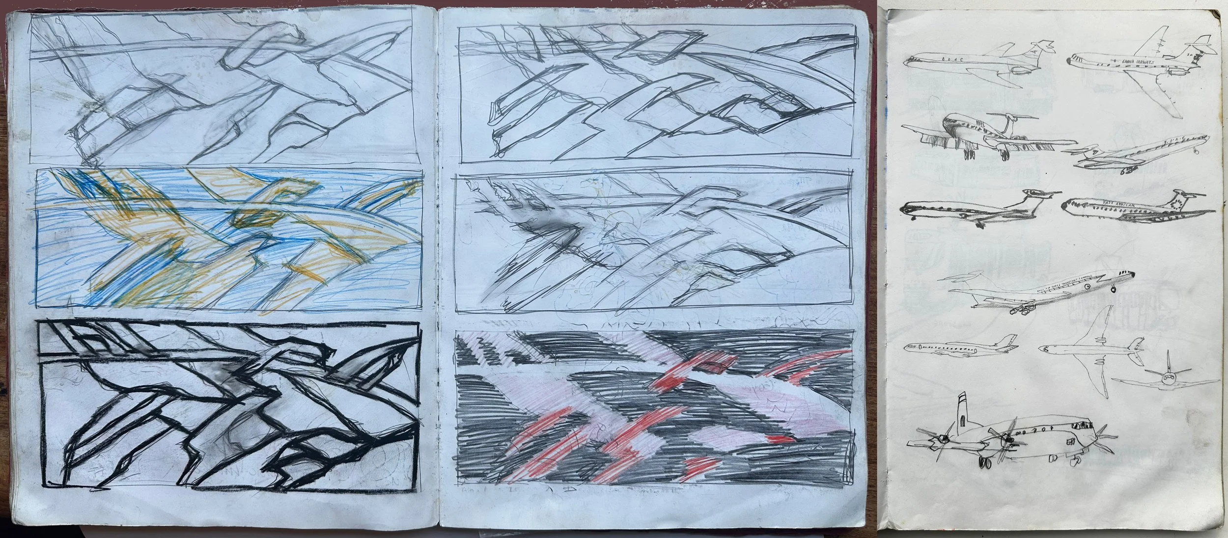
Sketchbook pages, Left: 1979, Right: 1983

Clouds and aeroplanes are scattered across the things I’ve made ever since; clouds recently and aeroplanes more when I had the ambition to reflect the modern world in my work, an ambition that has gradually been bashed out of me during the process of getting commissioned. For example, this is from a recent brief for a public commission:

Due to the context of the area, some elements should be avoided, including: Bright, harsh, or jarring colours. Strong cultural or religious symbols. People, animals, or potentially triggering flowers. Confronting, busy, or clinical/medical imagery. Bodies of water including lakes, rivers and seas. Vehicles/machinery. Text, inspirational quotes.

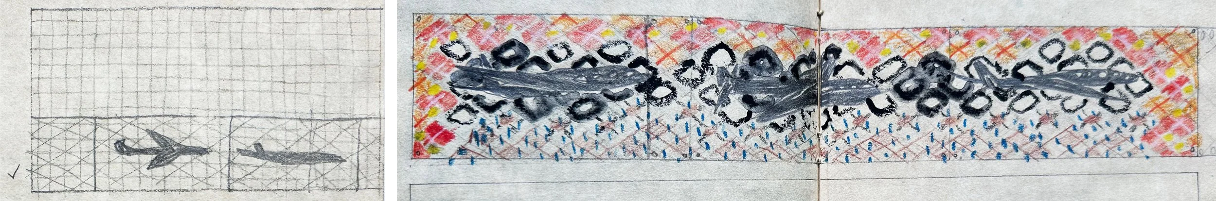
Parts of pages from 1984 sketchbook

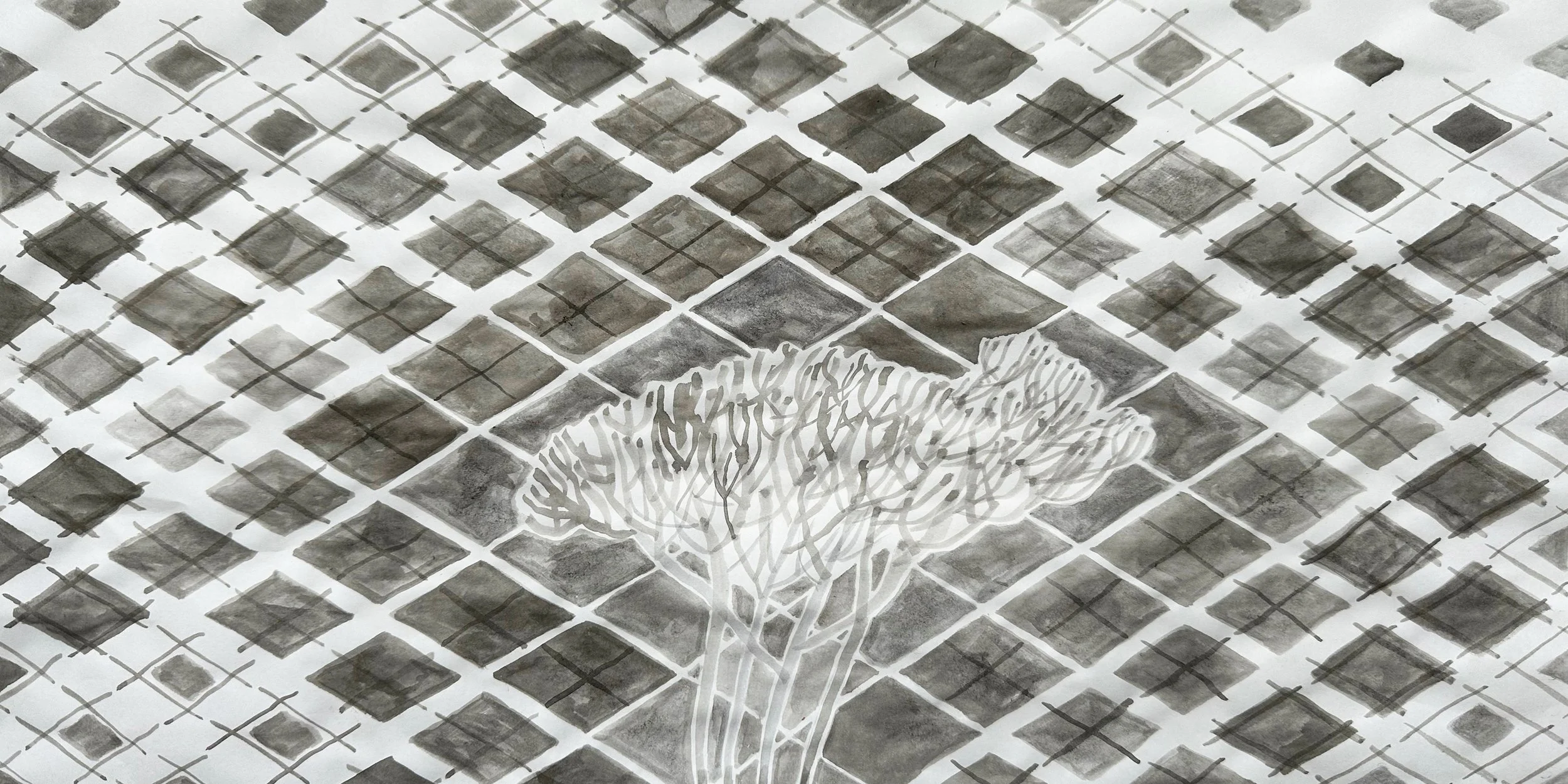
I found two aeroplane panels among my stack of old stained glass. I had a feeling there were once three, but I could just be remembering the drawings, as the one with the tick next to it only had two planes (above left). I’d later made them into patchworked panels having chopped off the corners where fixing holes had been drilled. This time I kept all the original pieces I could find and leaded them up as a way of keeping the pieces together. I particularly liked the backgrounds to these designs, on the diagonal to give a feeling of the expanse of the sky scape, with plain diamond clouds behind the planes and then the pattern changing as it spreads above and below them. I had never chucked my geometric backgrounds out with the vehicles and machinery, and had a go this week (shown at the bottom) at using the pattern again in black and white with a cloudy tree top standing in for the original flying machines .

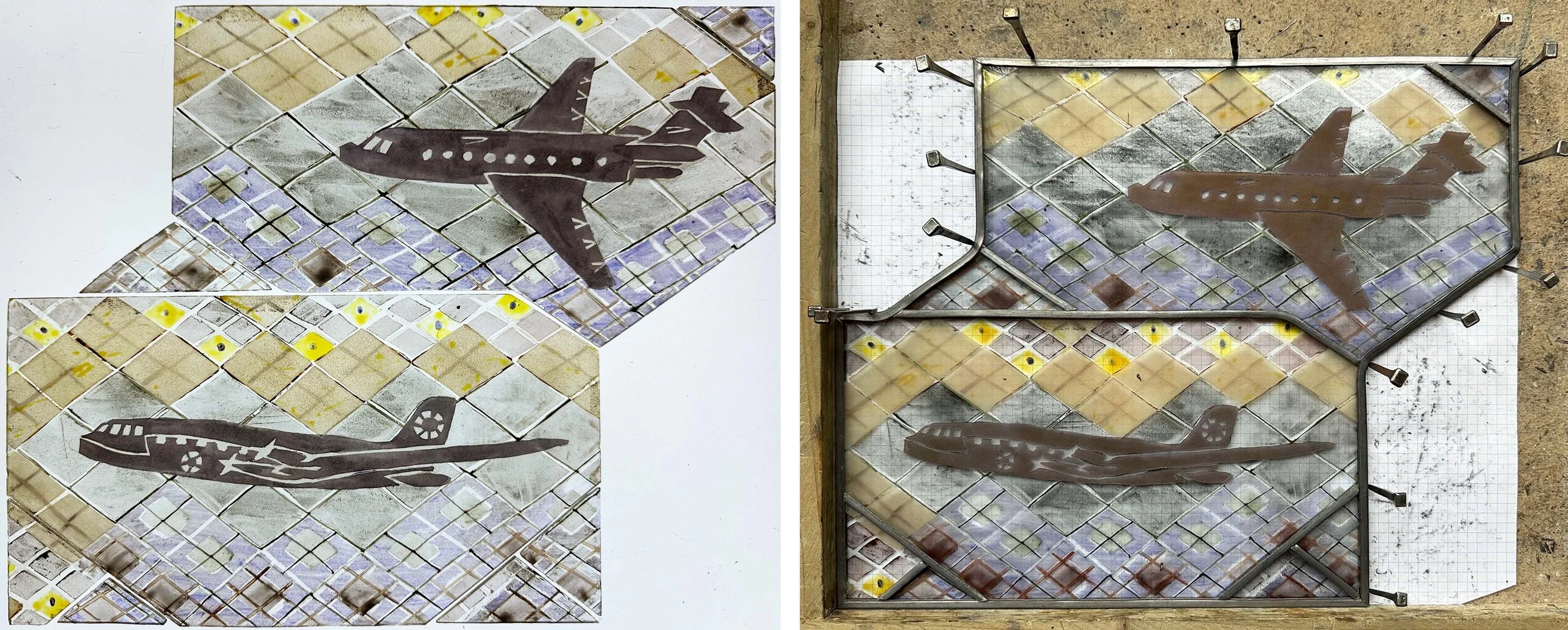
Panels made in 1984, then cut up, now leaded together again.

Vertical Landscapes by Sasha Ward

The rug page in my June 1983 sketchbook, and the centre of the rug itself.

The threadbare rug in my studio is an inherited one and has fascinated me for years, as documented by a drawing of it in my 1983 sketchbook (above). I loved the way that the landscape had been turned into a vertical pattern of loosely drawn scales, one of which is a lake rather than a mountain. I’ve been thinking about vertical landscapes recently because I’m designing a set of vinyls for very tall windows, 4.6 metres high. Although I could ignore the divisions between the windows and float the design across the window frames, I’m more inclined to emphasise the vertical and treat each as a separate window.

Left: Installing the fake windows in the new Lidl. Right: The drive-by commission I did for Lidl in 2017.

Left: St John Hospital Chapel, Lichfield 1984. Right: All Saints, Farnborough. Memorial window for John Betjeman 1986.

These two approaches are evident in rows of windows from many different periods of stained glass design. The first pair that I thought of are by John Piper (above). On the left hand window the shapes in the design link up, with the mullions cutting through the figures, whereas the window on the right consists of a separate picture in each opening, with the result that the fish confined to the right hand window seem to float up into the air.

The second set of examples (below) are windows in Wiltshire from the nineteenth century. In the crucifixion scene on the left, it’s not the figures that cross over the mullions but the landscape and sky behind them which become a row of coloured bands. The Warrington window on the right uses all sorts of decorative devices - borders, columns, canopies - to split up the shapes while still keeping enough room in the middle for some spectacular rocks, clouds and trees.

Left: St Mary, Nettleton, Wiltshire, Crucifixion window by E.R. Suffling 1892. Right: Christ Church, Bradford on Avon, window by William Warrington 1857.

Easy to keep photos vertical with the camera phone.

The subject matter for this commission is based on the local South Gloucestershire landscape. On my walks and drawing trips around the area I’ve been looking for features that split up the landscape, obviously trees which are also useful as borders, but also fences, buildings and paths. I’m aiming to make a composition that is richer than a stripy landscape and is something that you can’t mistake for an advertising banner.

Not to so easy to keep my drawings of hillsides, parks and paths vertical.

Inspired by the Hudson River School by Sasha Ward

View across the Hudson from Blithewood, Bard College, Annondale-on-Hudson, 2023 and 2000.

Staying with my brother on a recent holiday in New York State I spent a lovely morning drawing the view across the river from the lawns of Bard College (above left). We had visited the house of the father of the Hudson River School, Thomas Cole, and I was using the style I’d picked up from looking at his paintings, with paintbrush blobs for distant trees and picturesque details in the foreground. When I got home I looked through sketchbooks from previous visits (shown below) and was astonished to find a drawing I did 23 years ago from pretty much the same spot (above right).

My USA sketchbooks, clockwise from top right: 1996, 2000, 2012, 2023.

Looking through the sketchbook from my first visit there in 1996 I found more versions of the view, usually framed by the summer houses of historic houses that line the riverbank but behind the railway that seems to run through the water. The old drawings practically line up with the new (below left) as if my hand remembers the drawings I always do when I’m there.

Left: More views across the river, 1996 and 2023. Right: House in Annandale-on-Hudson 2000.

Left: Thomas Cole, River in the Catskills, 1843. Right: Frederick Church, Catskill Mountains from the Home of the Artist, 1871.

In 1996 we had visited Olana, the house of Thomas Cole’s pupil, Frederick Church, that he had built in a spot with fantastic views. Some of my work from the following years was consciously influenced by Church’s use of landscape motifs - mountains, waterfalls, sunsets - and the solitary foreground tree that cuts across the horizontal layers of the landscape as shown in my sketchbooks below.

View across the River Hudson to the Catskills, 1996 & 2000.

If I’m not drawing the river, or the view across the street from the porch, I draw the view through the window, recording the different houses we have stayed in on each visit. Again I was surprised by the repetition in what I’ve chosen to draw, with pine trees making another, looser grid right up against the windows of each house.

Windows, Rhinebeck 1996, Haggerty Hill Road 2012 & Bard College 2023.