contemporary stained glass

Two more stories by Sasha Ward

Just Another Story Two black and white drawings by Ray Ward, the second one shows the same scene from inside the room.

Just Another Story Two black and white drawings by Ray Ward, the second one shows the same scene from inside the room.

Just Another Story is an old drawing of Ray’s that he had a copy of on his studio wall with the intention of using it as inspiration for a painting, however I managed to grab it first. In my glass interpretation of the drawing (below) I focused on the architectural setting of the scene, using a white sandblasted line on dark red glass for the exterior and the opposite, a dark red line on white opalescent glass, for the interior. I didn’t want to confuse the lovely simplicity of the lines by introducing lead lines into the picture and I couldn’t quite decide which glass to use for the thickness of the wall between the hopeless man and the sagging woman. I tried the muranese glass (below left) which makes every composition sparkle and which I’ve been overusing, but finally settled on an olive green strip (below right).

Just Another Story Stained glass panel in progress

Just Another Story Stained glass panel in progress

As soon as I put those three colours together, I saw that I could extend the piece by making a leaded border to suggest the extension of the cross section through the house using glass of different tones and textures in the same colour combination. This gave the figures more space and also provided a place to write the title, something I’d intended to do on one of these pieces before but never found the right place.

Just Another Story Final version 385 x 300 mm and detail showing glass textures in natural light.

Just Another Story Final version 385 x 300 mm and detail showing glass textures in natural light.

MememememeME Egg tempera on gesso 375 x 530   Bad Shadow Ink on Paper 420 x 596 mm, both by Ray Ward

MememememeME Egg tempera on gesso 375 x 530 Bad Shadow Ink on Paper 420 x 596 mm, both by Ray Ward

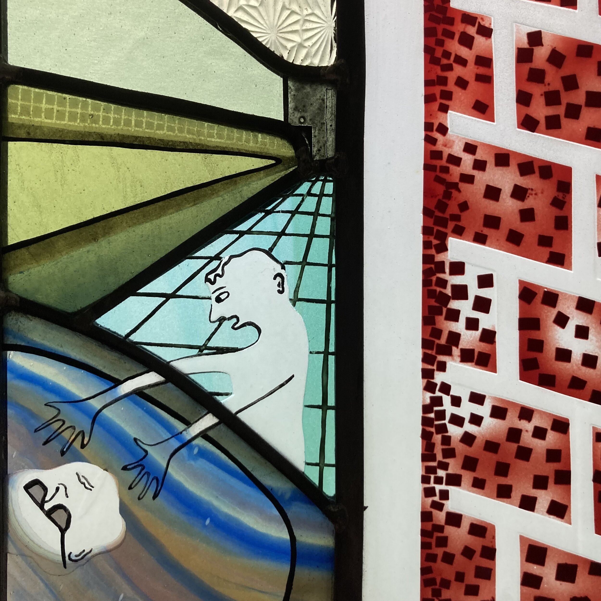
The other drawing of Ray’s that I chose to work from at the same time was one of several versions of a bathroom scene viewed through a window. The most recent version (above left) looks exactly like our old house on Five Stiles Road, but as it’s too hard for me to work from a coloured original I went back to an earlier drawing (above right) where the picture is more extreme, both emotionally and in its lines of perspective. In case you’re wondering what it’s all about this is a quote from Ray.

“For the record, he is seeing a reflection (shadow) of someone he dislikes, any sort of hate being self hate being the sub text. I should know.”

So is this “There is generally some idea behind them all but sometimes knowing that ruins the picture so not always worth knowing”, which is an attitude I adopt as I get on with choosing and cutting the glass.

Bad Shadow: Left, glass pieces cut & laid over copy of drawing. Right, first attempt at stained glass panel.

Bad Shadow: Left, glass pieces cut & laid over copy of drawing. Right, first attempt at stained glass panel.

This panel turned out to be tricky, I had an idea for the bricks which took two layers of sandblasting over a complicated stencil to match the sharp dots in the original drawing. The shading and painting on the bathroom pieces also took two goes, the first time I leaded up the panel (above right) there wasn’t enough sense of space so I added more dark lines and shading, then refired and releaded the pieces (below). This panel is one that looks much better and richer in the natural light of the window rather than on the even light of the lightbox, which to me is a sign of success.

Above, Bad Shadow, final version 325 x 385 mm. Below, detail of Bad Shadow.

Above, Bad Shadow, final version 325 x 385 mm. Below, detail of Bad Shadow.

IMG_1914.jpg

TV angel by Sasha Ward

Let The Light In. Painting in egg tempera on gesso by Ray Ward 435 x 300 mm.

Let The Light In. Painting in egg tempera on gesso by Ray Ward 435 x 300 mm.

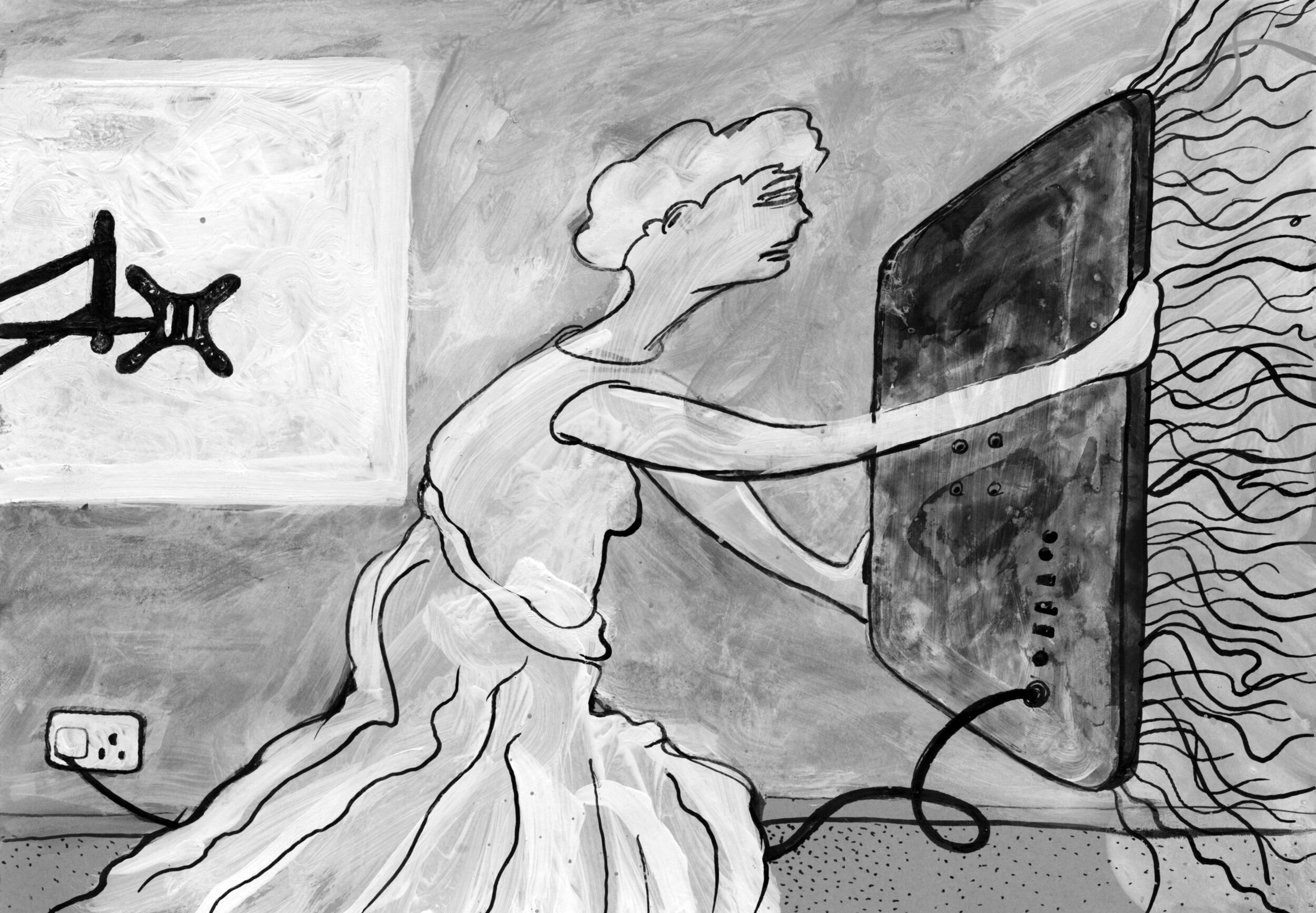
This recent painting of Ray’s (above) intrigued me, I couldn’t quite work out what the woman shielding herself behind the TV was up to. It is based on a black and white drawing, as they often are, which I thought made the situation clearer. In that version (below) the discarded wall bracket is more obvious and the composition more open, she is offering up the TV with her arms outstretched. This drawing, in its turn, was based on an annunciation angel in a carved relief that Ray photographed in St Martin of Tours Church, Chelsfield (bottom).

You Light Up My life. Drawing in indian ink and white acrylic on black card by Ray Ward

You Light Up My life. Drawing in indian ink and white acrylic on black card by Ray Ward

IMG_2537.jpg

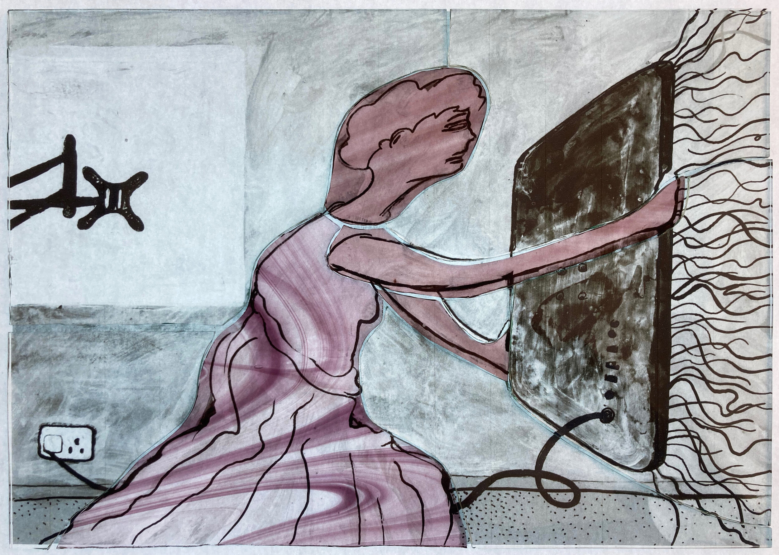
The interesting history of Ray’s painting made me want to add to the chain by making a stained glass version. I based this on the black and white drawing, only changing it by using a pink and yellow colour combination which is a classic in stained glass angelology. The glass pieces (below) show that the only pieces of coloured glass I used were two types of streaky pink on the angel, the yellow being a thin wash of silver stain fired on the back of the glass. As in all the panels I’ve made in this series most of the details are done with sandblasting and/or painting with black, brown and grey iron oxides.

Glass pieces cut and laid over an enlarged photocopy of Ray’s drawing

Glass pieces cut and laid over an enlarged photocopy of Ray’s drawing

Finished panel on the lightbox, 250 x 360mm.

Finished panel on the lightbox, 250 x 360mm.

The finished panel is shown above on the lightbox and below on my windowsill in the sunshine. Its title also has a history - Ray had called his painting ‘The Teacher, Look in Here and All Will be Revealed’ but then forgotten that fact. When I asked him for one he came up with two song titles, ‘You Light Up My Life’ which I used for the stained glass panel and alternatively ‘Let The Light In’ which he used as the new name for the painting. By then I’d been calling it TV Angel, so this little image actually has four names.

Finished panel in the sunshine

Finished panel in the sunshine

Adding without ruining by Sasha Ward

Windows made from scrap pieces of glass are a stained glass staple. In churches old pieces are leaded together in a different formation to make new windows, and in my own work I have always used offcuts, samples and broken pieces to make patterned windows, patchwork style. However, most of the samples I make for larger commissions are on thicker glass with large scale designs, not great for chopping up but ideal as the first layer in a new piece of work.

Experiment 1 with drawing and collage on top, 500 x 260 mm

Experiment 1 with drawing and collage on top, 500 x 260 mm

Experiment 1 (above and below) started with a leftover computer cut stencil from a large scale project which I stuck on an old piece of float glass to try out a coarse sandblasting grit. The first bit of enamelling, the red and purple on the left, was another leftover, this time from a bit of very runny spray painting. After firing the effect was so nice that I added another layer, or maybe two, of hand painted enamel enjoying the way that the grainy texture on the glass affected the colours. I spent a long time after these unphotographed stages drawing, collaging and photoshopping to find shapes that would add to the composition, hiding the muddled sections, keeping the best parts and not ruining what I already had.

I like the finished piece so much that it’s still in my studio window months later. The four narrow windows that I added to the design were sandblasted out, then each filled with a different enamel colour with a lot of flux in the mix to make them very pale. What was underneath slightly comes through and the new enamel colours perfectly compliment the ones that were already there.

Experiment 1 completed and detail.

Experiment 1 completed and detail.

Experiment 2 in the window and on the light box, 470 x 450 mm

Experiment 2 in the window and on the light box, 470 x 450 mm

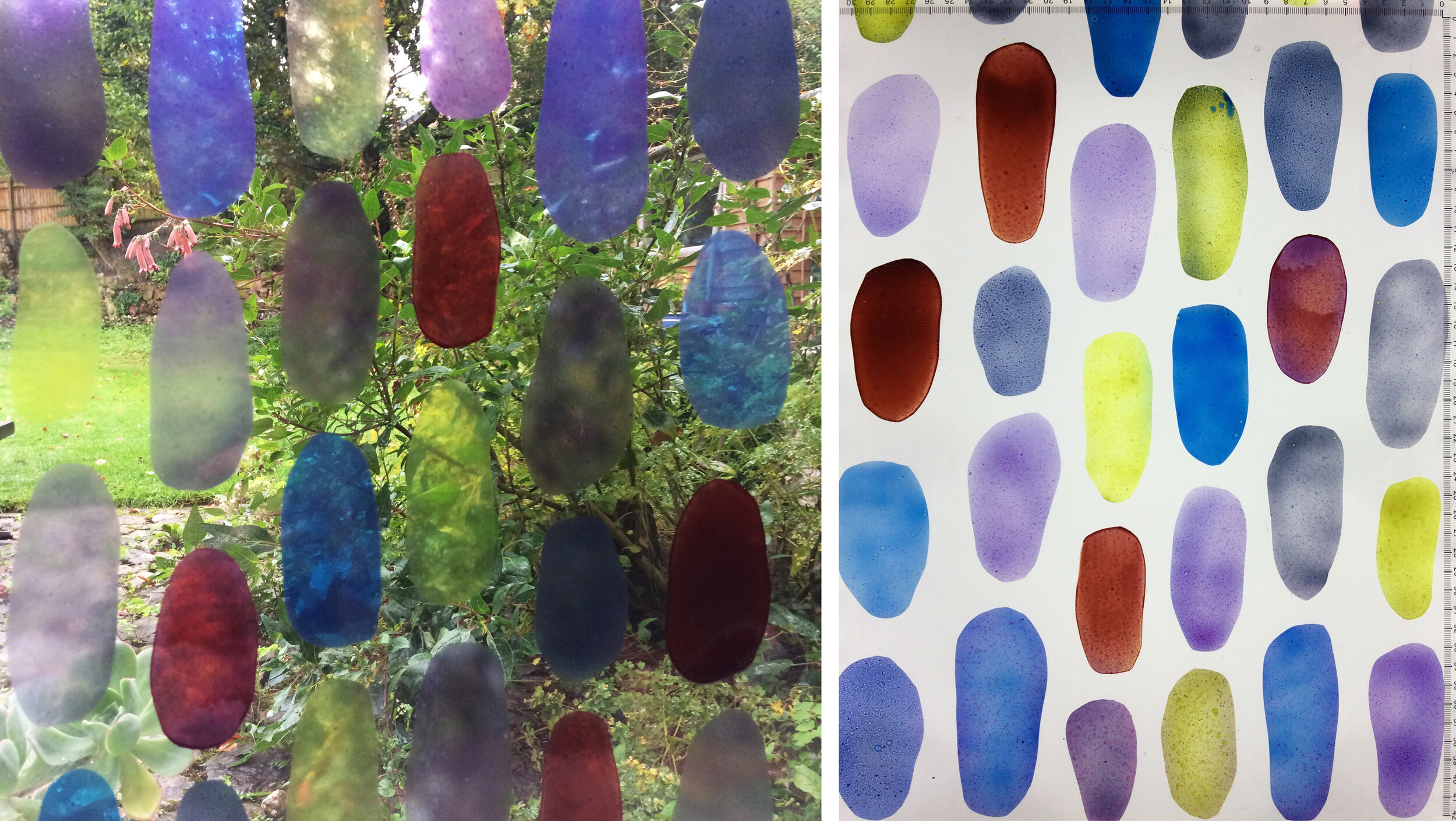
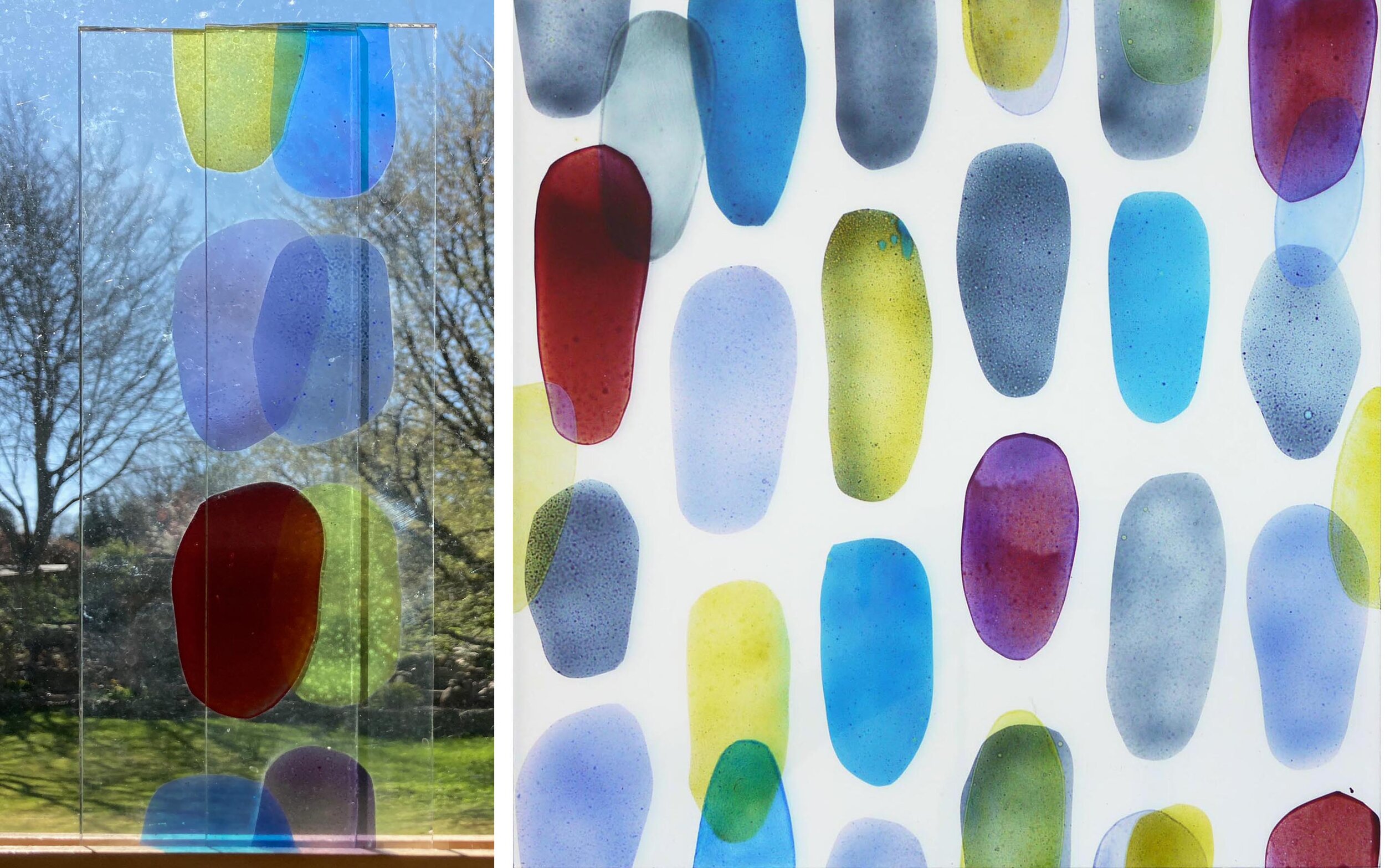
Experiment 2 (above and below) presented a different set of challenges. I had a large piece of glass where I’d tried out old glass enamels in rough ovals, there were some lovely qualities in the different enamel mixes but no overall shape to the composition. I decided to use it as the first layer of a new piece, 300 mm square, for the online exhibition of work by members (I’m a new one) of the British Society of Master Glass Painters as these marks and colours seemed to celebrate the joy of glass painting. I spent an even longer time on the next stage of this one, planning patterns around the shapes and additions to them inspired by the effect of the overlapping offcuts in my window (below left).

I know by now not to rush into things, I was very conscious that I mustn’t ruin the piece by interrupting the stillness at its centre. Instead I thought about the concept of tessellation and added more ovals where they were needed to make the tile roughly tessellate while creating just a few areas of overlapping colour. It looks much better on its own than when I did tesselate it as you can see below.

Experiment 2: Left, overlapping pieces.  Right and below, turned into a tessellating tile.

Experiment 2: Left, overlapping pieces. Right and below, turned into a tessellating tile.

blob 3.jpg

Here is a link to lots of great contemporary stained glass squares in the exhibition on the BSMGP website.

The Cloud of Unknowing by Sasha Ward

correctpostersmall.jpg

This is the poster for our exhibition at Norwich Cathedral, as you can see from the dates it has just finished. Despite the lower visitor numbers to the cathedral and the extra restrictions imposed during the second lockdown we felt lucky to be showing anywhere this year. The exhibition centred around a series of panels made during lockdown when I turned some of Ray’s drawings into stained glass. Although we have worked alongside each other for over thirty years, we have never collaborated or exhibited together before.

Wall of glass: Four cabinets of glass panels with samples and drawings on the lower shelves & two larger panels on easels.

Wall of glass: Four cabinets of glass panels with samples and drawings on the lower shelves & two larger panels on easels.

The basic idea was to have a wall of Ray’s black and white paintings meeting a wall of my coloured glass panels. These panels were the ones I made during lockdown and will be familiar to readers of my blog. At the far end were the self portraits, at the near end were the collaborative pieces, and in the middle was the series of enamelled decorative panels called "‘Theme and Variations’. On the bottom shelves were enamelled samples from previous projects which showed up well just lying on white paper and on the shelves above were print outs of my blog entries which describe the making of my glass panels.

Cabinets 1&2: Self portraits, fragments, glass paints and the start of the Theme and Variations series.

Cabinets 1&2: Self portraits, fragments, glass paints and the start of the Theme and Variations series.

Cabinets 2,3&4. Theme and Variations and the collaborative panels.

Cabinets 2,3&4. Theme and Variations and the collaborative panels.

I thought visitors to the cathedral would be interested to learn about the technical side of stained glass, as the guides and volunteers you get in such places are always more interested in a window’s history and iconography. In the cabinets I showed samples of all the types of glass paint I use (yes - it’s still called stained glass even if it’s heavily painted), the tools of the trade and a new panel in progress. I made this just before the exhibition opened and I’ve been looking forward to seeing it again as I think it may be an important bridge between the work I’ve been copying from Ray and my own artistic path (below).

Panel in Progress:  Left, glass pieces cut, painted and fired. Right, in the exhibition showing the leading up process.

Panel in Progress: Left, glass pieces cut, painted and fired. Right, in the exhibition showing the leading up process.

Wall of black and white pictures: 46 paintings in indian ink & egg tempera on gesso hanging together in a cloud. 

Wall of black and white pictures: 46 paintings in indian ink & egg tempera on gesso hanging together in a cloud. 

The pictures are written from scratch, I have no idea what they are going to be when I start. I have displayed them in groups on the wall forming clouds which you can see as a whole. But if you look harder you can always see something else in the cloud whether it is a camel, a weasel or a whale.” Ray Ward

ray 3.jpg

Ray decided to hang his paintings, a recent series of egg tempera and indian ink on gesso, in a cloud formation hanging from a hidden bar where the wall meets the ceiling. A lovely shadow was created by the shape, which swayed slightly in front of the ancient stones and flints. One reason for hanging the paintings like this was to provide a space for the titles to be written up, large enough to read from a distance. Covid restrictions led to this solution which proved to be a lot better than the handouts you might normally provide as it put the words alongside the pictures, forming verses in your head:

Why are girls so obsessed with cats I really don’t think there’s much we can do. The problem is everything will be alright They’re wrong I’m more scared of success then failure. We will talk but have nothing to say The wind plays recalling madness, heartless cold reproof. Is anyone here enjoying this? An echo is not a reply.

A full catalogue of Ray Ward’s work in the exhibition can be found on his website, link here

ray wall 2 copy.jpg