Staircase windows, each panel 880 x 300 mm
Just installed is this three part internal window for artist blacksmith and friend Melissa Cole in her newly built house. At front left in the snap above you can see a corner of her balustrade, it’s made of lines of metal that look like a scratchy drawing, and hopefully a bit like the scratchy lines in the landscape part of my design. The themes in this window revisit subject matter from my Kelmscott designs where roof shapes were placed in a pattern made from the local landscape.
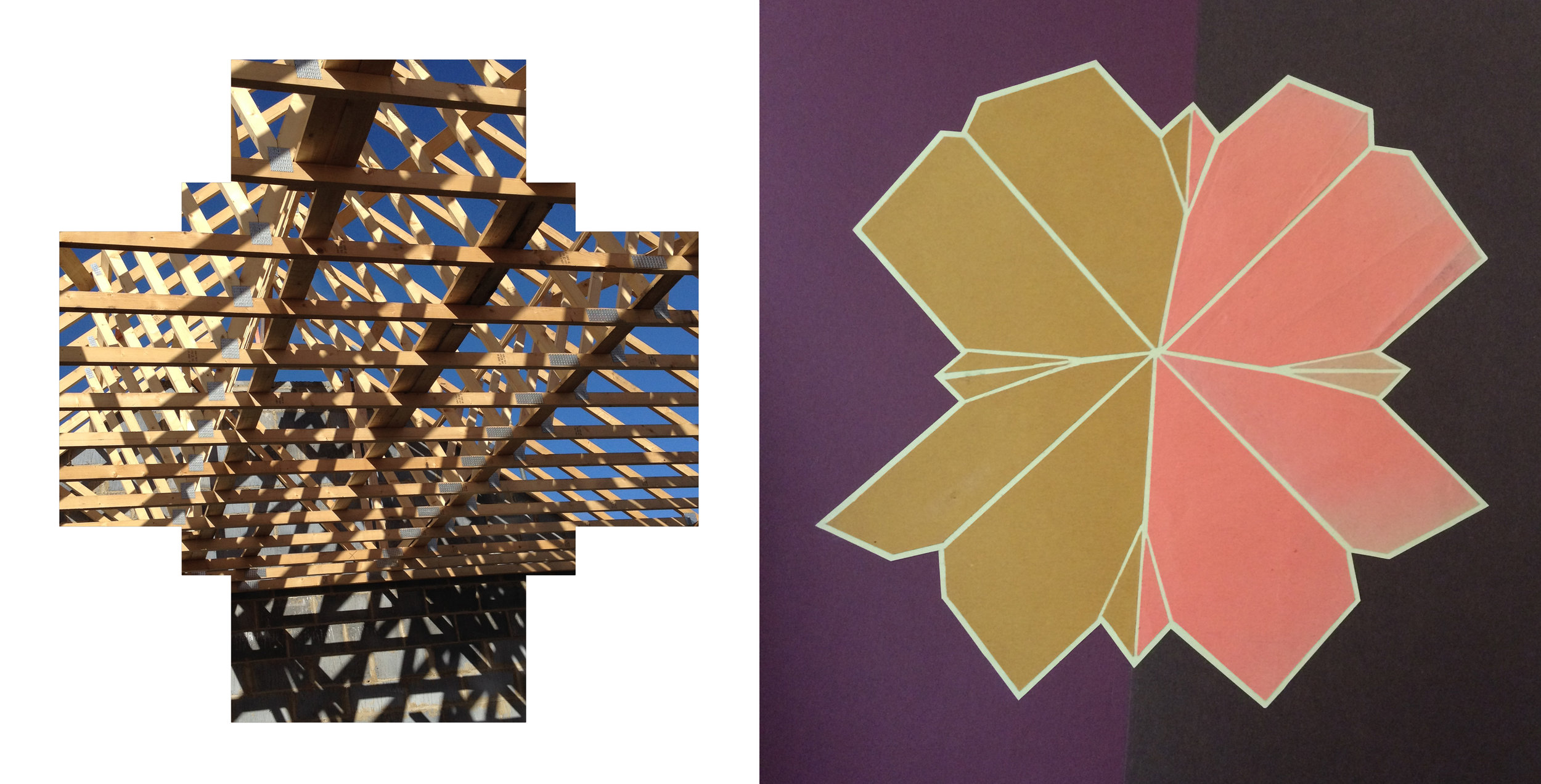
When I visited the house during construction, the set of plans (below) was up on the wall - how could I resist basing my design on a roof plan that looked like a flower?
Roof under construction: flower roof
I liked my first sketches, collages of the roof under construction and the flower roof shape. However, I found it hard to work them into the format of the window openings. So I made a 3D model of the roof, with the aim of stretching it to a landscape format without losing the real shape.
House in the landscape: paper model of the roof
sketches showing development of the design
As I developed the design, the geometric shape of the roof flowed into curves that spread into the surrounding areas. The straight lines tie the panels together across the roof cross, in the glass these are picked out with a sandblasted white line. I was pleased with the restraint I exercised in my use of colour. Once Melissa had chosen the strong orange and I had mixed up a metallic pink/purple for the roof (marvellous new colour that changes with light on or through it), there was only room for neutrals and a lot of white - the neutrals appear very green in the photo of the panels in my studio window below. As they should, the panels look best in the place they were made for. Thanks to an ideal, positive talking commissioner who insisted that it’s the artist who has to be happy with the work as much as the client.
Panels in the studio this summer.


