enamel

In the Window by Sasha Ward

Left, roadside front window before. Right, kitchen window.

Left, roadside front window before. Right, kitchen window.

As you can see in the two pictures above, the windows in my friend’s new house have restricted views. At the back, the kitchen looks on to a concrete wall with tiles and objects positioned wherever they fit. At the front, there is a busy stretch of main road and a pavement close up to the low window. Although she has made it look great with her objects and stick on patterns, she wanted some pieces of my glass in front of the window to block the traffic in a more colourful way.

This was after seeing the rows of random samples I always have in my studio window, slotted into wooden grooves fitted across the window frames. At the moment (below right) I have my most recent samples, some colour test strips and a few samples that stay every time I have a reshuffle so I suppose they must be my favourites. I’ve used grooved wood for shelves in the window since I was a student at the Royal College of Art (years ago, picture below left), with a great view of the Albert Hall and a changing display of the pieces I was painting on top of a backlit piece of glass.

Left, my window at The Royal College of Art in 1985. Right, my studio window this week (2019).

Left, my window at The Royal College of Art in 1985. Right, my studio window this week (2019).

Left, roadside window after. Right, colours through the glass.

Left, roadside window after. Right, colours through the glass.

Choosing glass offcuts or old samples, cutting them up and arranging them in a row is like making a fragment-style stained glass window. That is, anything looks OK but there is an art to the ordering and cropping. These pieces are big at 400 mm tall, and from many different periods so I did a bit of work to unite them with two rows of circles sandblasted out and filled with green enamel. It means that you can still play around with the order and orientation of the pieces. The best part, as always, was seeing the colours projected through the glass on to the carpet in the afternoon sun (above right).

Detail of three panels, originally samples for The Centre Livingston, private house & Manchester Children’s Hospital.

Detail of three panels, originally samples for The Centre Livingston, private house & Manchester Children’s Hospital.

Rooflines by Sasha Ward

Staircase windows, each panel 880 x 300 mm

Staircase windows, each panel 880 x 300 mm

Just installed is this three part internal window for artist blacksmith and friend Melissa Cole in her newly built house. At front left in the snap above you can see a corner of her balustrade, it’s made of lines of metal that look like a scratchy drawing, and hopefully a bit like the scratchy lines in the landscape part of my design. The themes in this window revisit subject matter from my Kelmscott designs where roof shapes were placed in a pattern made from the local landscape.

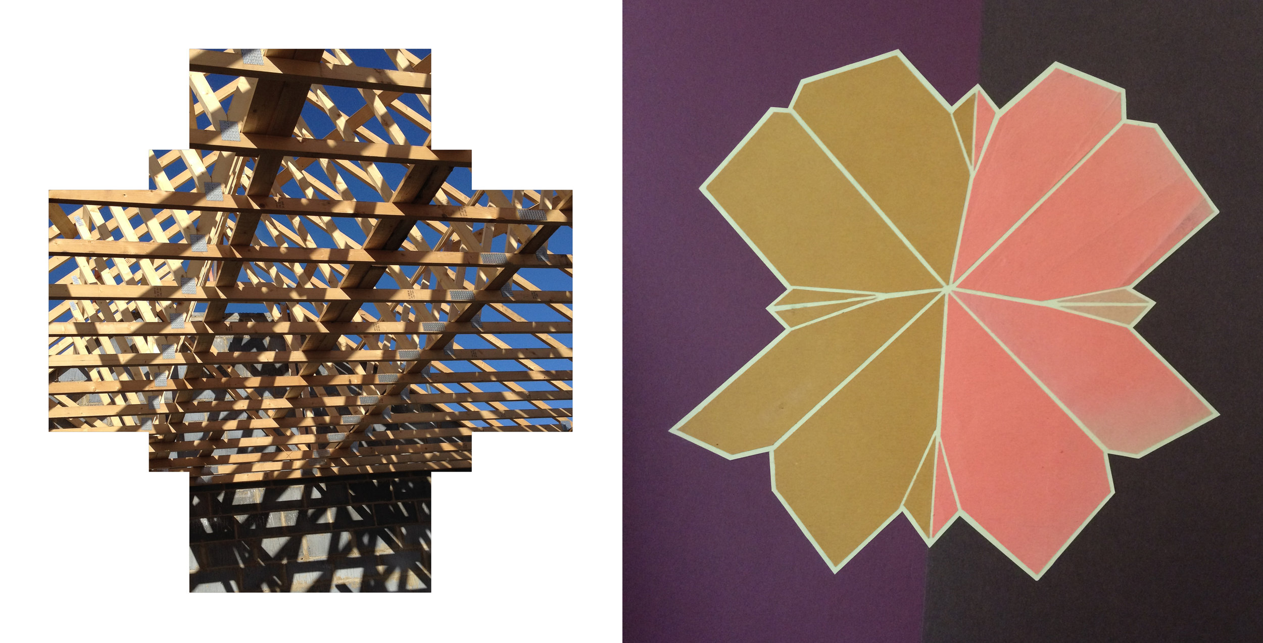
When I visited the house during construction, the set of plans (below) was up on the wall - how could I resist basing my design on a roof plan that looked like a flower?

bm1.jpg
Roof under construction: flower roof

Roof under construction: flower roof

I liked my first sketches, collages of the roof under construction and the flower roof shape. However, I found it hard to work them into the format of the window openings. So I made a 3D model of the roof, with the aim of stretching it to a landscape format without losing the real shape.

House in the landscape: paper model of the roof

House in the landscape: paper model of the roof

sketches showing development of the design

sketches showing development of the design

As I developed the design, the geometric shape of the roof flowed into curves that spread into the surrounding areas. The straight lines tie the panels together across the roof cross, in the glass these are picked out with a sandblasted white line. I was pleased with the restraint I exercised in my use of colour. Once Melissa had chosen the strong orange and I had mixed up a metallic pink/purple for the roof (marvellous new colour that changes with light on or through it), there was only room for neutrals and a lot of white - the neutrals appear very green in the photo of the panels in my studio window below. As they should, the panels look best in the place they were made for. Thanks to an ideal, positive talking commissioner who insisted that it’s the artist who has to be happy with the work as much as the client.

Panels in the studio this summer.

Panels in the studio this summer.

Thirty Year Old Enamel by Sasha Ward

Chapel window for L.M.S. 2.4m x 1.2m. & detail of central panels. Recent photos after cleaning.

Chapel window for L.M.S. 2.4m x 1.2m. & detail of central panels. Recent photos after cleaning.

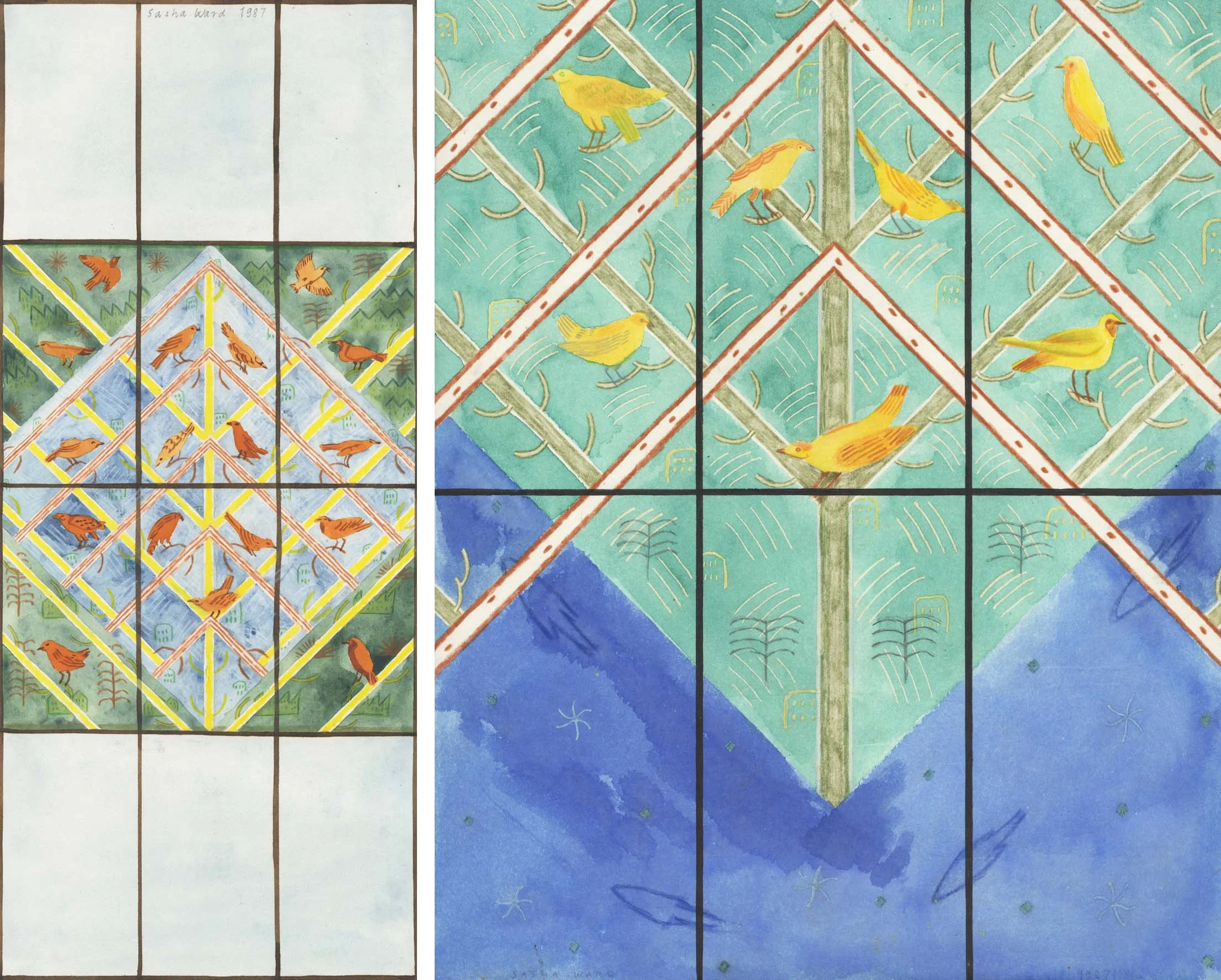
My first large commission, in 1987, was for my old school, Lady Margaret School in Parson's Green, London. This commission for the chapel marked the school's seventieth anniversary, so for the occasion of the 100th birthday party I decided to revisit and give the window a good clean. No reflection on the cleaning regime at the school, it's just that I have seen what can happen to an unprotected enamel surface over the years, particularly in damp conditions. In this case, the window looked dull and opaque because of the build up of a patina on its surface, but the window was dry and the enamel underneath the grime unharmed, as you can see in the details above and at the bottom of this post. I used cotton wool and the  cleaning paste "astonish" to shine up the greens and yellows. The blue at the top and bottom was always semi opaque and scuffed to look a bit like my water colour design (below).

Left: Original design for the chapel window.  Right: Bottom of the final design (compare with the same section in glass shown above).

Left: Original design for the chapel window.  Right: Bottom of the final design (compare with the same section in glass shown above).

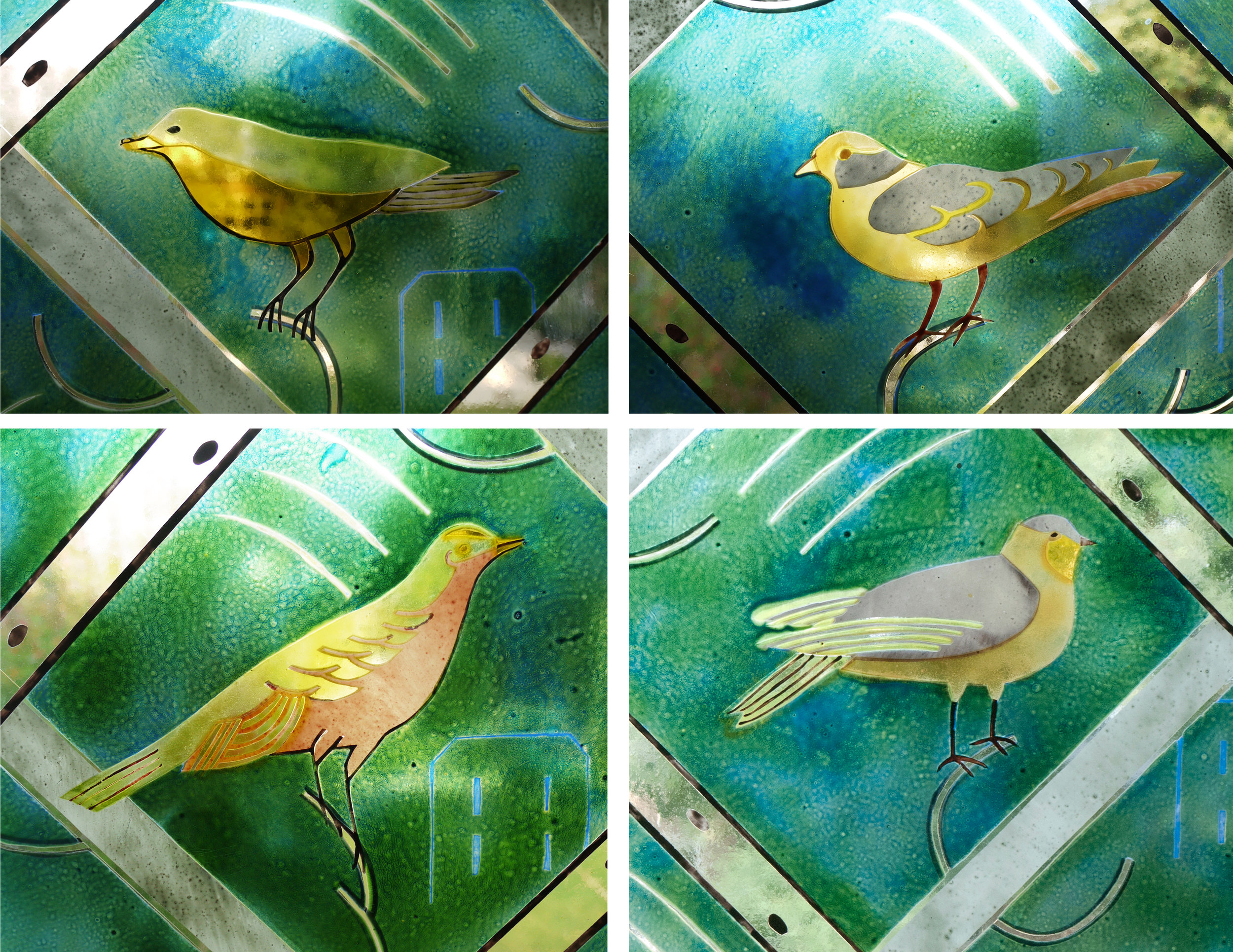
I dug out the design when I got home and remembered that they had initially asked for just the central six panels (above right), then extended the commission to cover the whole window. I reworked the design, swapping the colours around so that I had more of the lovely layered green. On the day of my visit I found the design quite basic, but I think it also looks strong and the geometry works well with the architecture and as a framing device for the birds. I used birds because of my previous commission where this was the stipulated subject matter. My bird shapes and their regular placing in the composition came from my stamp album where stamps were sorted by subject matter rather than country. The bird detail at top left (below) looks like a good copy of Uruguay (below right).

Some of the bird pages in my old stamp album.

Some of the bird pages in my old stamp album.

panel 4.jpg

In these four details you can see the layers of transparent enamel contrasted with areas of silverstain, opaque iron oxide, clear glass and acid-etched details, all in pretty good condition.

Sliding squares by Sasha Ward

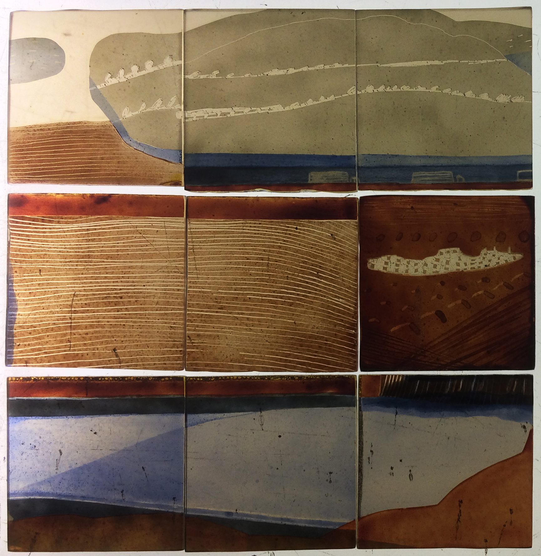
The Motorway from a field in Wanborough, 146 x 217mm    View of Motorway and Swindon, 146 x 217 mm

The Motorway from a field in Wanborough, 146 x 217mm    View of Motorway and Swindon, 146 x 217 mm

I found some of my old glass squares and decided they needed rearranging, much like the sliding squares game in feel (especially as I tried to use the thinnest possible lead and the slightly smaller blue piece kept dropping out of place). The glass came from a project I worked on for The Community Forest in Wanborough in 1993, where I did pages of sketches looking at the view towards Swindon.

images.jpg
Drawings from a field in Wanborough 1993, the two views were used in the glass panels above.

Drawings from a field in Wanborough 1993, the two views were used in the glass panels above.

I still find that area fascinating, just a couple of fields separating some classic Wiltshire villages from the motorway cutting and the dual carriageway that marks the start of Swindon. I particularly love the view of the Honda factory on the east edge of town, in the sunshine it looks like a shiny ocean liner.

'Honda Factory and Charlbury Hill', drawings numbered 7 & 8 from my 1993 series.

'Honda Factory and Charlbury Hill', drawings numbered 7 & 8 from my 1993 series.

I was so happy with the results, it seemed such an easy way of getting somewhere that I thought I'd do some more - pulling apart old stained glass panels, sandblasting, painting and refiring sections. However, it is hard to make something that looks effortless. My next composition needed a lot of shifting around, eliminating unnecessary pieces, trying to keep hold of my original intentions and retain an element of playfulness.

Work still in progress 'Sliding Squares: Honda Factory' 1993 -2016

Work still in progress 'Sliding Squares: Honda Factory' 1993 -2016

Transformation by Sasha Ward

Offcuts standing sideways in my studio window, each 1 metre tall

Offcuts standing sideways in my studio window, each 1 metre tall

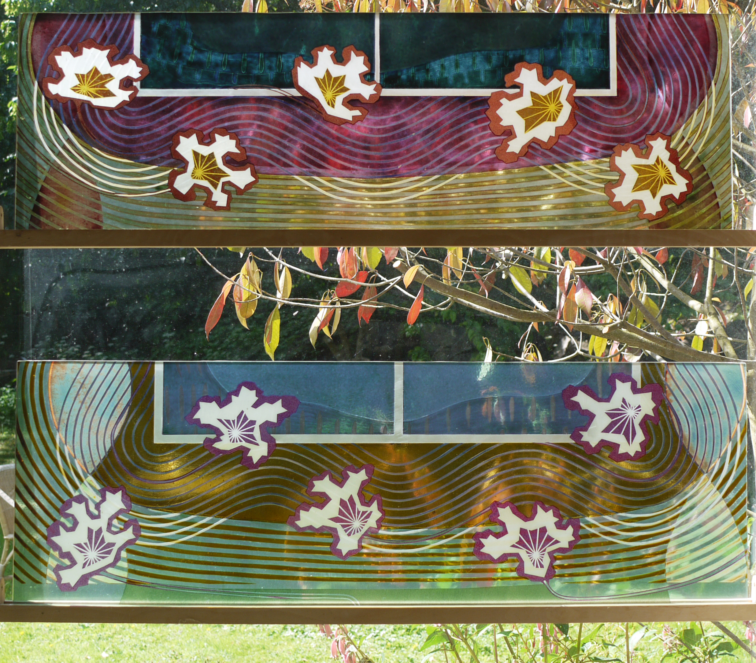
I had a commission to make two fanlight windows for a friend's house in Poland. She said offcuts would do, so I put two leftovers sideways in my studio window and waited for inspiration. I had made the glass in 2000 for an exhibition, the pink one broke and I remade it in yellow but was never satisfied with the results. You can see in the pages below from my 2000 sketchbooks that there was a lot going on here - how could I add something while also making sense of a poor composition ?

Meanwhile another friend, the artist Wendy Smith who I met when we were students together, came to stay. She had a lot to say about the process of transformation, you can read about it on her blog. Her ideas spoke to me about the danger of overworking versus making a fresh start. I have often tried to make new pieces on top of old samples and all I got was a struggle made visible.

The new panels in my studio, finished last week.

The new panels in my studio, finished last week.

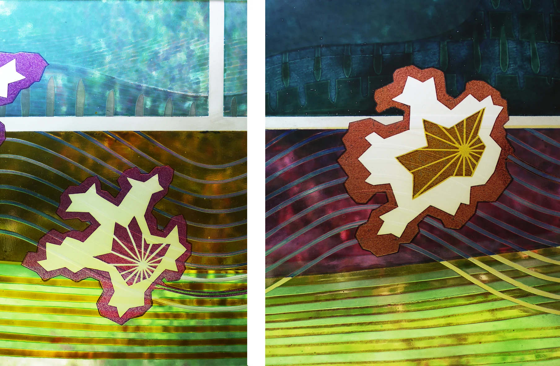
This time, I sandblasted across the glass backgrounds with star/flower shapes, as if embroidering figures across a patterned and pleated fabric ground. The yellow ground got pink details, the pink ground got yellow and a fantastic rich amber made from a mix of enamels. You can see the depth of the old lines under the surface of the glass in the details below.